Recommended
Blog Post
The State of Global Education Finance


CGD NOTE
Advancing the Agenda in Girls' Education Research
This is the third of our biennial updates on global education aid finance—you can read the previous updates from 2021 here and 2019 here. In these posts we examine aid data from the OECD, analysing how much aid is going to education, where it is allocated, by who, and through what channels. The latest available data, which we use for this analysis, is from 2021.
Highlights in this update: COVID-19 didn’t have the impact on overall levels of education finance that some of us predicted. Some new charts on aid fragmentation (or lack of it), and a closer look at whether localisation of aid is actually happening (TL;DR: it isn’t).
In this blog we use the term “aid” to mean Official Development Assistance (ODA). This includes grants and concessional loans provided by official agencies, which are spent with the promotion of the economic development and welfare of developing countries as the main objective. In places—such as when we are looking at donor fragmentation—we also include Private Development Finance or Other Official Flows, and we mention this.
Aid to education: the big picture in 2021
|
Aid donors spent |
$15.1 billion |
On education in 2021. |
|
Of this, |
$2.8 billion (18 percent) |
went to low-income countries |
|
…with |
$9.8 billion (65 percent) |
going to middle-income countries |
|
…and |
$2.5 billion (17 percent) |
supporting regional projects. |
|
The majority of education aid: |
$12.2 billion (81 percent) |
is spent bilaterally, |
|
with the sector spending only |
$2.8 billion (19 percent) |
via multilaterals. |
Chart 1: Aid to education reached $15 billion in 2018 and hasn’t moved much since
Aid to education has increased substantially since 2000. After a plateau between 2010 and 2015, education aid rose and has flattened again, so that across all our education aid updates there’s relatively little change. Despite expectations that education aid would increase during the peak of COVID-19 school closures, we don’t see any sign of an overall increase in 2020 or 2021—in fact they’ve fallen since 2019.
The main education funds—the Global Partnership for Education and Education Cannot Wait—are not included in the OECD data, but the money that they raise from each donor country is accounted for. If we were to add these funds to this chart, then we’d be double counting money that flows into and out of these funds (we include them in later charts and discuss their role too).
Chart 1. Education aid disbursed over time (USD billions, 2020 constant prices)
Note: we include all disbursements reported as Official Development Assistance in the OECD Creditor Reporting System. We show the 15 largest donors in 2021.
Chart 2: Donors have very different—and very consistent—priorities for their education spending
The main education donors (by volume) spend their money very differently. The USA allocates almost all of its education aid to basic education—mostly early grade reading and school feeding programmes. Meanwhile, Germany, France and Japan allocate the majority to post-secondary education, mostly by financing students who choose to study in their countries.
On the whole, donors continue to support the same phase(s) of education year-on-year. Turn to the USA if you want support with foundational literacy and numeracy, talk to the multilaterals if you want to expand secondary schooling and speak to the EU or the World Bank if you want something a bit more ‘General’, that can cover multiple phases of schooling.
Among the main donors, only the UK shows a change in the way it spends, pulling back from an emphasis on Basic education. While some may criticise Germany for spending so much on the costs of students studying in Germany, it’s put a lot more into lower levels of education too. Germany’s annual aid to everything except higher education and vocational training increased from about $0.7 billion to $1.2 billion between 2013-15 and 2019-21. Which almost perfectly mirrors the cuts made by the UK in that period.
Chart 2: Average annual education aid disbursed in period (USD billions, 2020 constant prices)
Note: We include all disbursements reported as Official Development Assistance in the OECD Creditor Reporting System. Countries are ordered by their contribution to Basic education in each period. We add disbursements from the Global Partnership for Education based on their financial reports and assign that spending to Basic education.
Chart 3: Children in low-income countries receive the most aid, but low-income countries do not
In low-income countries, education aid amounts to $14 per child, more than the $9 in lower-middle-income and $8 in upper-middle-income countries. But income group averages are strongly influenced by big countries (think India and China) and mask large variations in per-child receipts across countries.
If you instead look at the average (median) country in each income group, the picture reverses. The average low-income country receives $15 per child, which compares with $21 and $25 to lower-middle- and upper-middle-income countries respectively.
A few small(ish) middle-income countries that seem to get more than their ‘fair share’. Five middle-income countries have received, on average, more than $100 in aid per child for the past three years. But what’s fair? Reading between the donor-recipient pairs, each datapoint has a story to tell:
- West Bank & Gaza Strip ($328* per child): all about the ongoing work of UNRWA, the United Nations Relief and Works Agency for Palestine Refugees in the Near East.
- Albania ($187): large post-earthquake recovery finance from the European Union, plus teacher secondments from Austria and receipts for students studying in Germany and France.
- Moldova ($183): mostly scholarships for students to study in neighbouring Romania
- Jordan ($170): large receipts from UNRWA, the USA and Germany, for a range of basic and general education programmes.
- Mongolia ($101): a mixed bag, including large contributions from Japan for school construction and higher education development. Vocational training support from the Asian Development Bank, Korea and Germany, plus imputed costs for students studying in Hungary & Germany.
Chart 3. Education aid received per school-age child per-year, average over 2019-21 (USD, constant 2020 prices)
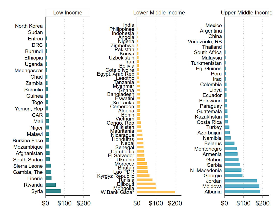
Note: So that we can see variation among countries, *West Bank & Gaza is curtailed to $200 in this figure, but receives $328 per child. We include all disbursements reported as Official Development Assistance in the OECD Creditor Reporting System. We pair these with data on school-age population at primary and secondary levels, from UNESCO Institute for Statistics. We exclude Small Island Developing States. Our latest data are from 2021 so do not include any war-related aid to Ukraine.
Chart 4: Fragmentation depends on your perspective—and what you mean by it
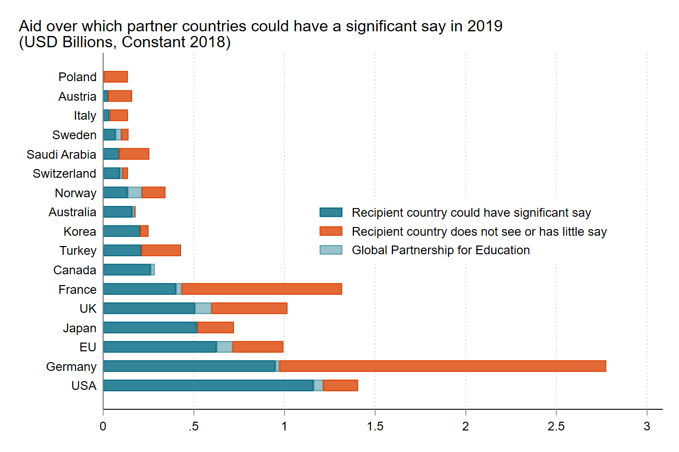
Debates about education aid fragmentation and donor coordination continue in 2023 in much the same vein as they were in 2019. As we write, a High Level Steering Committee is considering options to reorganise the education aid architecture, improve governance, strengthen the role of multilaterals and so on. And education ministers representing 86 partner countries of the Global Partnership for Education are calling for “Reinforcing country-led transformation by harmonizing and aligning external aid behind national priorities”.
Few aid-recipient countries have less than ten education donors and many face more than twenty, so it’s easy to see how corralling donors behind a single country vision is hard. As we’d expect, large countries have large numbers of donors, with India and Kenya topping the list. On average, $17 million more in aid means one more donor to face but there are many exceptions—play around with the map to see.
Despite the large count of donors, the lead donor contributes about a third of all aid and the top three account for 70 percent of receipts. The long-tail of smaller donors isn’t bringing much volume, but it’s possible they bring ideas and expertise. Where individual donors demand too much official time or resources to run programs—transaction costs that the Ministerial group refers to—local coordination mechanisms such as Education Sector Working Groups can play a role.
Or maybe fragmentation isn’t really about the burden on the government? The ministerial statement pits fragmentation against country-led transformation and alignment. If the problem is donors wanting to do their thing, splitting away from the country’s vision, then there might be bad news: Chart 2 reminds us how set in their ways donors can be. Fragmentation of ideas, views and values among donors is probably here to stay.
Chart 4: Number of education donors operating in each country (when you hover, aid receipts in USD billions, 2020 constant prices)
[Hover or click on countries to see how many donors are active, who the lead donor is, what share that donor gives, and more]
Note: for this analysis, we include all disbursements reported in the OECD Creditor Reporting System, including Other Official Flows and Private Development Finance. We add disbursements from the Global Partnership for Education and Education Cannot Wait, based on their financial reports. To avoid counting partnerships that are unlikely to lead to demand on government time, we exclude: (i) imputed costs for education and training in donor countries and (ii) all donor-recipient pairs worth less than $500,000 in the 2019-21 period.
Chart 5: A very small share of education aid is transferred to partners in recipient countries
Our colleague, Justin Sandefur, pointed out that foreigners don’t receive much of America’s $35 billion annual foreign aid budget, at least not directly. We were curious to see how this would pan out for education aid, from America and from elsewhere.
‘Localisation’ — what we mean
When talking about localisation, we mean the attempt to shift power from donor countries to local actors, be they governments, companies, local CSOs or NGOs. The many reasons for wanting to localise more aid include decolonising development and improving aid effectiveness. Localisation is about much more than how the money flows, but that is an important dimension and something we can look at systematically with the OECD data.
Donors have agencies, which make spending decisions. For each project, an agency will decide how to channel money and we can classify every aid disbursement according to its spending ‘channel’. Sometimes this will be aid spent at home, by local government offices, at other times it will go directly to the recipient government, e.g. as budget support. Some money may be channelled to a third party, like the World Food Programme to provide school meals. Other money will go to a university department for research. And so on.
The spending channel represents the direct recipient of the aid. Much of the aid received will go on to benefit individuals in recipient countries. But the body that holds the purse strings is clearly identified, and clearly different.
The wide variety of spending channels can be classified into four types:
1. “In Donor Country”: i.e. money is channelled to a donor government department (e.g. a German State to cover student costs), or any public or private organisation based in a donor country (e.g. the University of Oxford, RTI International etc.)
2. “In Recipient Country”: i.e. money is channelled to a recipient country government (e.g. the Ministry of National Education in Gabon) or any public or private organisation based in a recipient country (e.g. a local NGO).
3. “By Multilateral or International Organisation”: i.e. money is channelled to a multilateral or other multi-country organisation (e.g. money handed to UNESCO UIS to develop SDG4 indicators, or to Oxfam to provide an education information intervention). Note that money channelled via a multilateral (i.e. from the UK via UNICEF) is NOT the same as money disbursed by a multilateral (i.e. UNICEF spending in Togo from core UN resources
4. “Unclassifiable”: i.e. any other funding channel which we cannot identify and so cannot classify. Donors do not provide complete reports for all spending and this is prevalent for aid to conflict-affected states, for obvious reasons. This category accounts for less than 10 percent of all spending for the 2019-2021 period.
For the most recent three years, only 2 percent ($900 million) of education aid has been transferred directly to NGOs, Civil Society Organisations, private or other local organisations in low- or middle-income countries. In contrast, 45 percent of education aid ($22 billion of $47 billion total) is transferred by donors to their own government departments, to their own universities or to other organisations based in donor countries. We should stress that much of the aid received will go on to benefit individuals in recipient countries—but the organisation that holds the purse strings is not based there.
Despite much smaller volumes coming from multilateral donors, they tend to give directly to recipient governments. Multilaterals cannot—of course—channel aid via their ‘home’ government, instead choosing to channel $6.7 billion of their $8.6 billion total to recipient governments. This accounts for just over half of all aid received directly by recipient governments (note that the European Union is considered a bilateral donor in OECD data).
From a localisation perspective, an opportunity for improvement may see bilateral donors doing a lot more to spend directly via NGOs, Civil Society Organisations, private or other local organisations in low- or middle-income countries. Unfortunately, we’re unlikely to see much movement out of spending classified as “Government Imputed”—after all, this money isn’t really “spent” and so may not exist if it’s not being recorded against higher education budgets in donor countries.
Chart 5: Education aid disbursed in 2019-21, grouped by direct recipient (USD billions, 2020 constant prices)
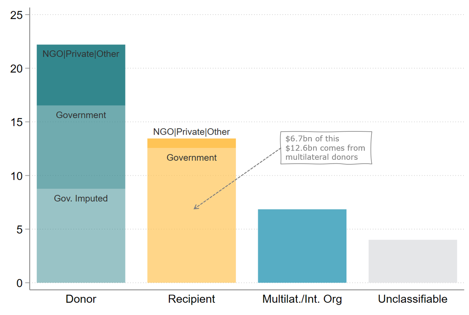
Note: We include all disbursements reported as Official Development Assistance in the OECD Creditor Reporting System. The figure shows the location and nature of the organisation through which the aid disbursement is channelled. If, for instance, the FCDO pays a UK firm to implement a program in Ghana, we would record it as Donor > NGO|Private|Other. This reflects the location of the organisation who controls the purse strings, whatever the share of that money is eventually spent in Ghana.
Chart 6: Among bilateral donors, most education aid is spent at home
When you break the big localisation picture down, only Japan prioritises spending directly in recipient countries ($1.1 of $1.9 billion). The other bilaterals keep much more of their education aid at home. There appear to be three types of home bias.
The first is the ‘Imputed Costs’ bias, shown by France, Germany, Austria and Poland with more than half of aid channelled to their universities to cover the costs of educating students from developing countries.
The second is the ‘Beltway Bandits’ bias—a preserve of the USA—and sees a large share of US education aid ($1.5 of $4.1 billion) channelled via companies and not-for-profits in the USA.
The third might be called a ‘Soft Power’ bias, with Germany, France, the USA and Turkey also channelling considerable amounts to government departments in their own countries. A large share of this is to cover the costs of scholarship programmes, or to fund projects that they run—such as Peace Corps volunteers, or Millennium Challenge Corporation in the case of the USA.
Despite its modest total contribution, Saudi Arabia gives more aid directly to recipient governments than do the UK, USA, Canada and Norway. In part, that’s because this cluster of mid- to large-sized donors prefers to spend via large international organisations.
You have to look very carefully to see the slivers that are spent directly via non-governmental, civil society and other organisations in recipient countries. But there are two sides to every story—the USA comfortably leads on this.
Chart 6: Education aid disbursed in 2019-21, grouped by donor and direct recipient (USD billions, 2020 constant prices)
Note: We include all disbursements reported as Official Development Assistance in the OECD Creditor Reporting System. The breakdowns are influenced (slightly) by how countries arrange their aid spending. For example, in Germany, the Deutsche Gesellschaft für Internationale Zusammenarbeit (GIZ) is a development agency that receives funds from the German Federal Government, so we report this as spending via ‘Donor Government’. If GIZ then runs a project that transfers money to an NGO in a middle-income country we do not see this in our data. However, in the 2019-21 period, our data indicate that GIZ received only 7.5 percent of Germany’s education aid and 15 of the 25 largest GIZ education projects had a ‘regional’ or ‘unspecified’ recipient. Taken together, we retain the OECD-DAC classification of GIZ as a Donor Government recipient and do the same for other countries with similar arrangements.
Chart 7: A few countries receive most of their nominal aid, others get very little directly
The biggest aid recipients, in nominal terms, are not necessarily the biggest recipients in terms of what is spent directly in their country. Take China—the recipient of the largest volume of aid over 2019-21—which ‘received’ $1.9 billion of aid, of which only $0.5 billion was spent directly in China. A much bigger $1.2 billion of China’s nominal receipt comes via donors imputing costs for Chinese students studying in their countries. The same story is true for India, Turkey, Morocco, Syria, Ukraine, Tunisia and a few others.
Contrast China with Bangladesh, the second largest recipient of aid, at $1.7 billion over 2019-21. A whopping $1.3 billion of this is spent directly in Bangladesh, and $1.2 of this is received directly by the Bangladeshi government. Other countries that see more than two-thirds of their aid spent directly in their country include: Nepal, Rwanda, Niger and Cambodia. Tanzania is the 15th largest recipient of aid, but jumps up to 4th in that list if you consider only aid that is received directly in the country.
Conflict-affected or -related countries also see a lot less aid than their nominal receipt would suggest. Chief among these are West Bank & Gaza, Afghanistan and Lebanon, where large international organisations such as UNRWA deliver services directly, or where the direct recipient cannot be identified for security reasons.
Chart 7: Education aid disbursed in 2019-21, grouped by direct recipient (USD billions, 2020 constant prices)
Note: We include all disbursements reported as Official Development Assistance in the OECD Creditor Reporting System. We add disbursements from the Global Partnership for Education and Education Cannot Wait from their financial reports. We show data for the 50 largest recipients of aid in the period.
Chart 8: in terms of how money is spent, the education and health sectors may be more alike than we think
There’s often a suggestion that the education sector should look and behave more like the health sector: channel more via multilaterals, use that to reduce fragmentation and lean on pooling mechanisms to raise more money. But the reality is that the two sectors are not that dissimilar—at least in terms of how much multilateral bodies spend as a share of all aid.
The kicker in all of this is the USA which has spent about as much to prevent and treat HIV/AIDS since 2019 ($13.5 billion, excluding any contributions to global funds) as education donors give to all causes in recent years. If we want global education to be a bit more like global health, then perhaps education needs to get better at selling a cause.
Chart 8: Share of aid disbursed by multilateral organisations since 2003, by sector (%)
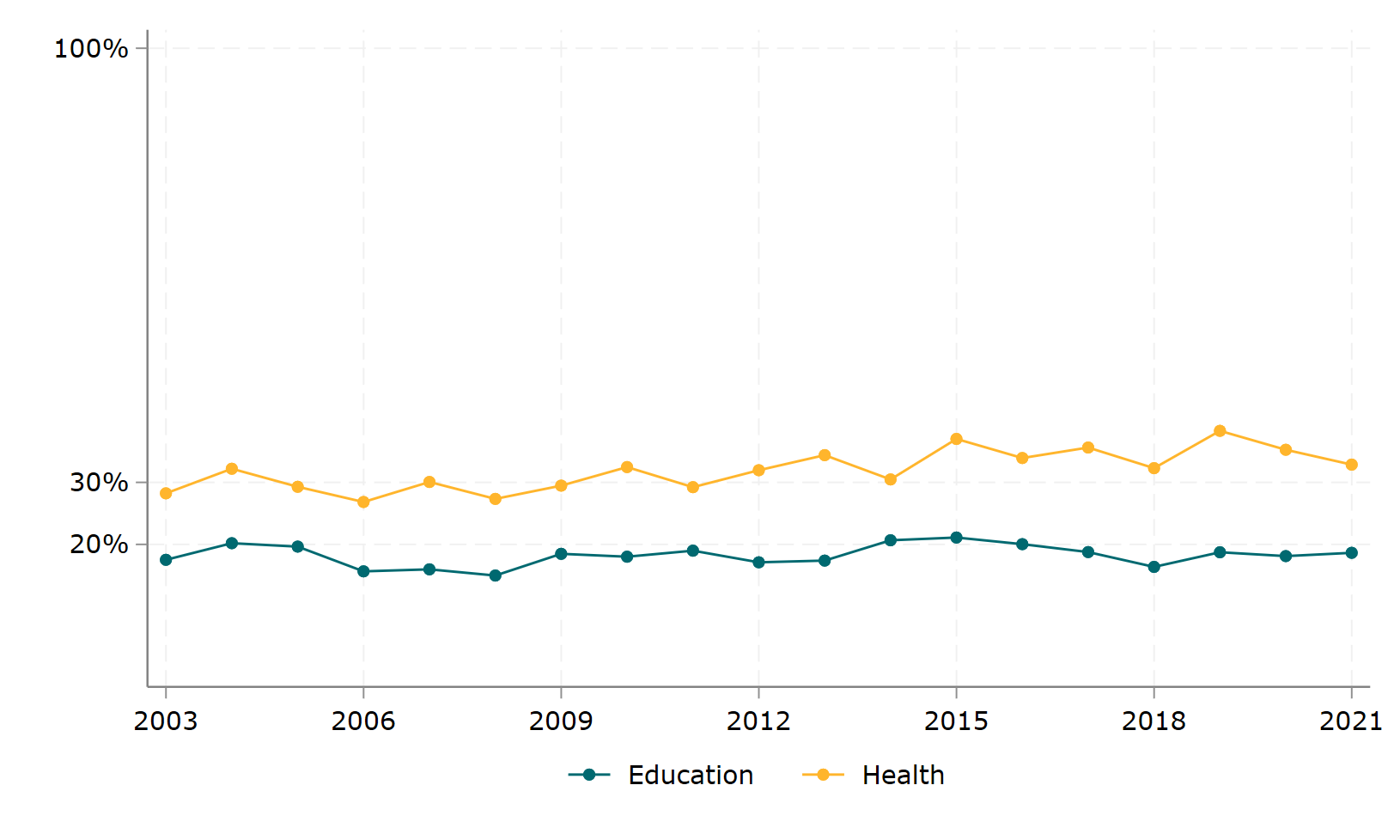
Note: We include all disbursements reported as Official Development Assistance in the OECD Creditor Reporting System.
Chart 9: education aid flows from and to lots of different places, with negligible amounts going through the education funds.
Chart 9: a complicated web of education aid flows (USD billions, 2020 constant prices)
[Hover over the figure for details on each flow and don’t miss the four organisations in this middle through which many donors operate]
Note: We identify in OECD data, funds that originate with bilateral donors but which are channelled through UNESCO and UNICEF, earmarked for particular projects, or which are transferred to the Global Partnership for Education and Education Cannot Wait, in the period. Outflows to recipient countries are included for education aid flowing through the Global Partnership for Education and Education Cannot Wait, based on their financial reports. The same is not possible for funds that flow through UNESCO and UNICEF whose outflows are grouped into multilateral organisations—i.e., their organisation type.
Our final chart depicts the spider web that is the complex, and perhaps inefficient, international aid architecture in education. If you want to dive into this web, hover over any of the nodes and you’ll see the corresponding inflows and outflows.
On the left-hand side are the major donors to education, along with their total disbursement in the past three years. The destinations of aid on the right-hand side, classified into the localisation categories we discussed in Chart 5. If you hover toward the middle of the chart you’ll find the education funds—Global Partnership for Education and Education Cannot Wait—plus UNESCO and UNICEF highlighted. Many donors pass funds through these bodies, but they don’t account for much of the aid flowing in the system. That said, the Global Partnership for Education and Education Cannot Wait do transfer the vast majority of their funds to recipient countries.
With thanks to Lee Crawfurd for helpful comments and to David Glass for talking us through Global Partnership for Education financial reports.
Topics
DISCLAIMER & PERMISSIONS
CGD's publications reflect the views of the authors, drawing on prior research and experience in their areas of expertise. CGD is a nonpartisan, independent organization and does not take institutional positions. You may use and disseminate CGD's publications under these conditions.