Recommended
COVID-19 is on track to be the most widely documented and researched public health emergency in history. A query on Mervix.org, a preprint server for health research, found over 4,000 items with reference to COVID-19 as of June 12, 2020. Epidemiological models of COVID have informed decision-makers across the world on the likely benefits of non-pharmaceutical interventions, and many models have emerged to predict the spread of the disease or the associated fatalities under different policy scenarios. Because COVID-19 is so novel, there are many uncertainties that complicate modelling: what percent of those infected are asymptomatic? How long do they stay infectious for? What is the basic reproduction rate (R0)?
Because of this uncertainty, there is value in different research groups working independently to build models. Different models will employ different methods, data, and assumptions and will seek to answer different policy questions. There are ongoing collaborative efforts to compare and understand models and their estimates (in the United States or for low- and middle-income countries). When model results are considered together, they may not provide precise point estimates but give decisionmakers a general direction of travel if model results converge or point to similar conclusions. But if they diverge, which model(s) should policymakers rely on and what information can they learn about the differences in estimates? There is undoubtedly an important role for models in public health planning, but could the presence of so many model estimates (of variable quality) also cloud judgement or confuse decisionmakers?
Here we take a look from an end-user’s perspective at what models can tell us, by looking for one example country, the Republic of South Africa. We choose South Africa because several estimates have been published by the South African COVID-19 Modelling Consortium (which we will abbreviate as the SA modelling consortium), Imperial College London (ICL), the London School of Hygiene and Tropical Medicine (LSHTM), and the World Health Organization’s Regional Office for Africa (WHO AFRO). South Africa is also unusual because it had estimates produced by a local group with their own model (the SA modelling consortium), developed collaboratively with local decisionmakers from the National Department of Health and National Treasury. This allows us to contrast local and global models. Many other low- and middle-income countries do not have this local support and will need to rely solely on global models—for them, the comparisons will need to be more thorough and really focus on the quality of data and methods.
We do not look at the mechanics of the models but only at what their results tell us about cases and deaths (it is worth noting that these models also produce other estimates, such as intensive care unit bed requirements or number of cases per day at the peak). We queried model results on June 11, 2020.
Relevant points about South Africa’s COVID situation
1st case: March 5, 2020; 50th case: March 16, 2020
March 18, 2020: general lockdown declared by president: restricted travel, closed shops and schools, and banned public gatherings
June 12, 2020: lockdown partially lifted, although “level 3” measures (sporting events allowed, increased number of people in theatres and cinemas, allowing international travel, new school calendar for children) still in place
Latest figures (June 12, 2020): 58,568 confirmed cases and 1,284 deaths
Can we compare model results?
Estimates of the number of cases and the number of deaths should, in theory, be comparable, as they are simple counts (although LSHTM produces interquartile ranges rather than point estimates). However, different time horizons and intervention scenarios make such comparisons rather challenging.
Let’s start with looking at the intervention scenarios that are modelled. We describe the main ones in the table below.
Table 1. Summary intervention scenarios modelled in the four studies.
|
Global/regional models |
Local model |
||
|---|---|---|---|
|
ICL |
LSHTM |
WHO Afro |
SA modelling consortium |
|
|
Not clear: scenario defined as ‘widespread community transmission’ resulting from failure of containment measures |
|
Note. We are paraphrasing from the description contained in the reports, please refer to the reports for more precise descriptions.
One of the first observations from the table is that only one scenario is fairly similar across those models: the unmitigated scenario (where no action is taken by governments or individuals). The scenario from the WHO AFRO model is not clearly defined but since it is described as “widespread sustainable transmission,” we assume this is equivalent to an unmitigated situation. The local SA model’s pessimistic scenario more closely describes the country’s response: it assumes an initial lockdown, followed by a period of restrictions (25 percent reduction in R0) and a failure to maintain those restrictions (with spontaneous social distancing of 10 percent). Other scenarios are somewhat difficult to compare, although some of the ICL and LSHTM scenarios (e.g. for shielding) are similar in their aims.
On time horizons, again there are discrepancies that may hinder comparisons.
Table 2. Time horizons in the four studies.
|
Global/regional models |
Local model |
||
|
ICL |
LSHTM |
WHO Afro |
SA modelling consortium |
|
Entire duration of the outbreak until a vaccine is developed (12-18 months from the time of writing) |
3, 6, 9, and 12 months |
52 weeks (approx. 12 months) |
Until November 1, 2020 (approx. 7 months) |
Note: ICL has also now worked on a new dashboard that provides short-time estimates for four weeks for LMICs which we do not cover in this piece
As shown above, not all models adopt comparable time horizons. However, even if the SA modelling consortium models the epidemic over 7 months, those 7 months should contain most of the epidemic since 95 percent of the South African population is modelled to be infected by end of October.
What do all four models tell us?
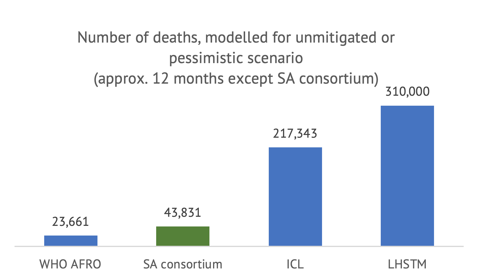
We first compare the numbers available for the unmitigated scenario, with the caveat that the SA modelling consortium figure does not have the same time horizon (but the estimates should be comparable).
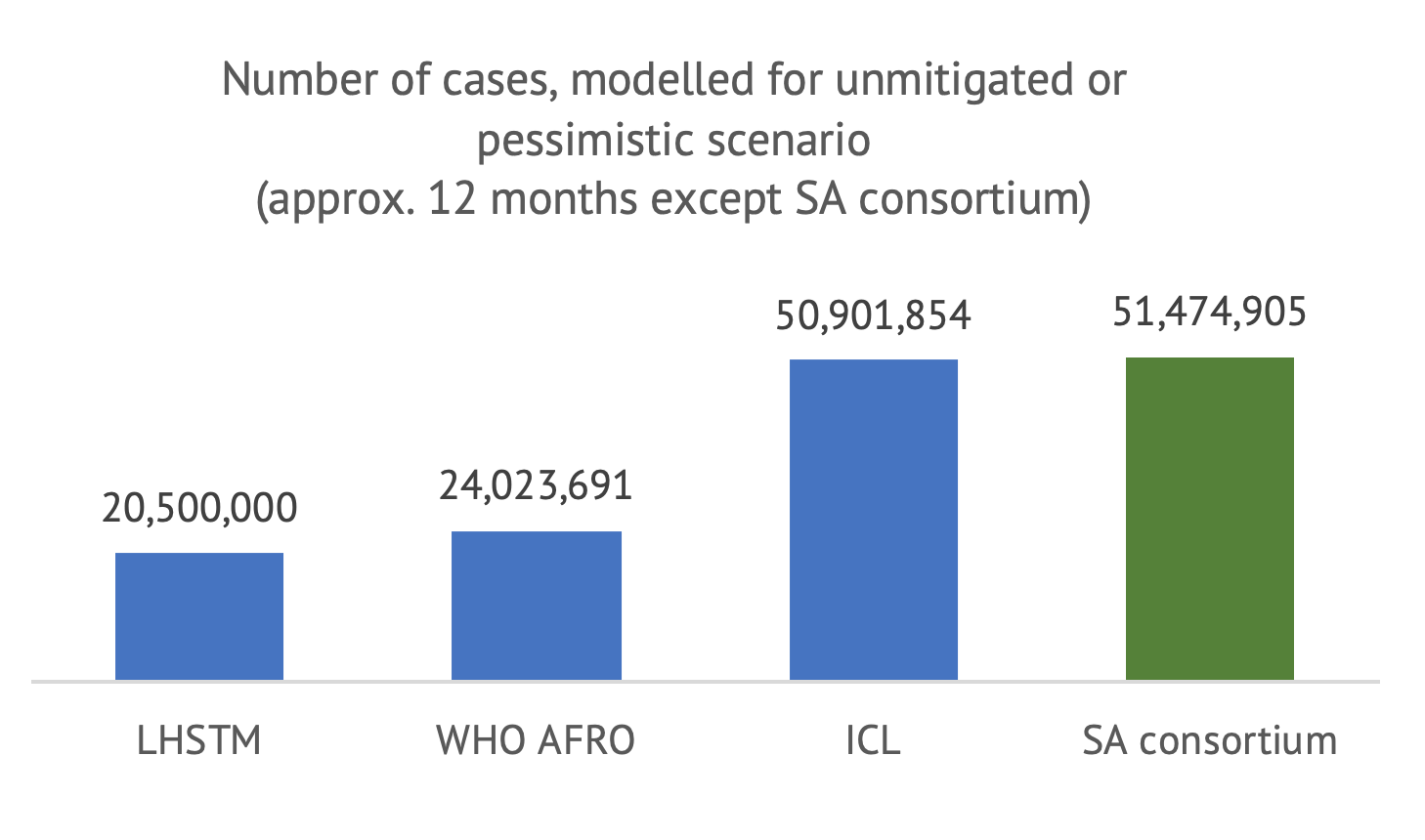
Note: LSHTM figure is the center of the inter-quartile range (270,000-350,000). It is not clear what defines a “case”; we assume all models consider all infections, whether asymptomatic or detected.
Note: LSHTM figure is the center of the inter-quartile range (270,000-350,000).
As shown above, even with a similar time horizon and scenario definition, the estimates differ widely between models. A first observation is that all models forecast that a very large portion of the South African population will become infected within twelve months (or until a vaccine is developed, in the case of ICL) under an unmitigated scenario. However, the number of cases projected by LHSTM and WHO AFRO are about half of those from ICL and the SA consortium. In terms of deaths, the divergence between the models is even more surprising: even if they estimate a similar number of cases, the difference in cumulative deaths between the WHO AFRO model and the LHSTM model is 13-fold.
These differences are meaningful. The LSHTM scenario suggests that, in the absence of any control measures, COVID-19 would have become the largest cause of mortality in the country, with a death toll 2.5x the death toll from HIV/AIDS and sexually transmitted infections combined (according to the Global Burden of Disease, latest year available). In total, the unmitigated scenario would lead to a 65 percent increase in total mortality, the total number of deaths in a single year. By contrast, the WHO AFRO model suggests that COVID-19 would represent a 4.9 percent increase in total mortality.
In terms of ordering of the different policy options, all models except for WHO AFRO (which only models one scenario of failed containment) suggest that the stricter the social distancing, the more lives saved from COVID-19. (For an approach that considers all lives affected and the policy response, see here.) Both the ICL and LSHTM find that shielding the elderly would save a significant number of lives but the magnitude of impact varies (as does the definition of shielding). LSHTM finds that shielding would lead to a maximum 20 percent reduction in deaths and ICL twice that (in both cases, compared to the unmitigated scenario).
Quick observations from considering all models together
-
Comparing different models is not straightforward. Definition of intervention scenarios and time horizon are important obstacles to comparing model results. We found model scenario descriptions very difficult to interpret and identify (in particular from the WHO AFRO). The only comparable scenario in our case was the unmitigated scenario, however as highlighted in a previous blog, it is the least realistic and useful for decisionmakers.
-
Model mechanics (or the modelling “black box”) are responsible for huge differences in results. Even when comparing the most similar policy scenario under the most similar time horizon, we find up to 13-fold differences in predictions between models. The low number of deaths modelled by WHO AFRO could be driven by assumptions that diverge significantly from other models: WHO AFRO estimates much lower transmission (almost half that of ICL) and much lower mortality (infection fatality rate at 0.1 percent, almost a quarter that of ICL).
-
Research all model results that are available for your country. As shown, the differences between models are very important, therefore it is essential for decisionmakers to survey all model results available to their country before settling for one option (or combining several options). Positive steps towards an informed use of models include: (i) Understanding what each model does (unpacking the “black box”), (ii) engaging with modellers who have built them, and (iii) making sure that the scope, data, and assumptions are reasonable.
-
Modelling scenarios are hard to translate into real-life policies. Most models consider different “intervention” scenarios, which correspond broadly to variations in the R0 or infection fatality rate. However, those are not “per se” interventions. Only the SA modelling consortium explicitly models interventions that have been implemented in the country, such as “lockdown” or other restrictions to public life. One of the likely reasons for not looking at interventions in global modes is that the effectiveness of non-pharmaceutical interventions in reducing R0 will be different in different geographies, populations, or when introduced at different time points in the outbreak. For instance, in high-density settlements or in countries with larger intergenerational households, R0 will differ and using a single-effect estimate in a global model is problematic. However, this is exactly what decisionmakers care about. What they need are models that estimate how different real-life policies implemented (or lifted) country-by-country, as monitored by the Oxford Government Response Tracker, for example, affect transmission and mortality. In other words, knowing what the impact on the outbreak is of reducing R0 by 30 or 75 percent is not very informative unless they know what they need to do to achieve this; whether through closure of borders, closure (and reopening) of schools, test and trace, closure of public transportation, and so on.
-
Predicted versus observed outcomes can’t be easily compared. Intuitively, one potential way for policymakers to choose between models would be to compare model estimates against observed data, even if this comparison cannot be perfect. LHSTM’s model and the SA modelling consortium’s work are perhaps the only models in this review that could allow users to do this because they at least they define a clear time horizon, although it is still too early to do so.
Verdict: No coherent story has emerged from trying to combine results from all four models
Modelling has become a critical, inevitably political, and hotly contested ingredient in national policy response discussions (South Africa is no exception). Beyond an indication that strict, sustained social distancing is likely to save lives from COVID, those four model results for South Africa provide little reassurance on a clear path to follow.
As the epidemic progresses, learning how to draw meaningful policy conclusions by comparing the results from multiple models will be essential to help countries navigate the outbreak as best as they can.
Topics
DISCLAIMER & PERMISSIONS
CGD's publications reflect the views of the authors, drawing on prior research and experience in their areas of expertise. CGD is a nonpartisan, independent organization and does not take institutional positions. You may use and disseminate CGD's publications under these conditions.