A set of more or less arbitrary lines continues to do very strange things to discussions about development. Most strange and arbitrary: country income classifications, with their division into low (<$1,036), middle ($1,036–$12,625), and high (>$12,625). Almost as strange and still pretty arbitrary: $1.25 and $2 poverty lines. We worry about aid allocations, who should give aid and contribute to global public goods, and poverty and middle-income traps all based on measures that only matter because we say they do: they’re the placebo poison of development. To focus on the country-income classifications, here are two reasons they really can’t be justified:
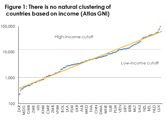
1. There is no natural grouping of economies based on GNI per capita.
Figure 1 lines 178 economies up according to their current Atlas GNI and then plots their GNI on a log scale alongside a trend line. If there were natural groupings of countries based on clusters of economies with similar GNIs separated by income bands with very few countries in them, the GNI line would have flat stretches followed nearly vertical stretches. But in fact, the GNI line follows the trend line very closely, showing that countries are spread fairly evenly in the space between richest and poorest. There is no strong sign of natural country groupings here. The dotted lines mark (approximately) the current income cutoffs. They appear to be poorly placed to capture what clustering does occur.
Source: World Bank
2. Country income status does not correlate with trend breaks or end points in anything else we care about
Take the slightly less arbitrary cutoff of $1.25 a day. As we all now know, most people living on the wrong side of that cutoff are in countries that have only just recently crossed the threshold out of low-income status. Figure 2 (the dotted lines are, once again, the income cutoffs) suggests middle-income status does not guarantee an end to $1.25-a-day poverty — it doesn’t even mark a break in what is a messy relationship. (One reason it is messy: $1.25 poverty is measured in purchasing power parity while income classifications are measured using market exchange rates). Surely out of all of the potential variables out their covering health, education, components of national output, the environment, and everything else there are some indictors that suggest some sort of break somewhere near the low- or middle-income cutoffs, but it would be fair to say that’s by luck not design.

Source: World Bank
And yet, despite the fact country-income classifications really don’t have any grounding in anything apart from our imaginations, we have imbued these lines with awesome power. Some examples:
1. We declare countries no longer need IDA when they reach just into middle-income status. Countries only a little way into lower-middle-income territory are no longer eligible for World Bank IDA or GAVI funding. You might have thought decisions on aid allocation might take into account some actual measure of need for external financing to achieve goals we want to promote with assistance. But why bother with that when we have an arbitrary cutoff? If IDA really matters for growth (and this paper suggests it does), our allocation based on arbitrary lines is really bad news for aid effectiveness. (Of course the cutoff is far from universal: the global share of ODA to low-income countries has actually declined from a high of 58 percent in 1994 to less than one-third today).
2. We think we have a whole new development challenge because a bunch of big countries that have only just recently crossed the threshold out of low-income status still have some people living on below $1.25 a day. To some extent this is the flip-side of the first problem — it turns out middle-income countries aren’t rich. The real challenge is to our classification scheme (and possibly to Paul Collier’s Bottom Billion royalties).
3. We think that only high-income countries should give ODA and otherwise act as responsible global citizens in areas from trade to the environment. At the other end of the classification schedule, you don’t stop being a developing country until you have a GNI of $12,616. Using purchasing power parity rather than the (odd) Atlas GNI methodology, around 3.5 billion people worldwide — half the planet — live in countries with a 2010 average income of $6,000 or above. That’s about the same as the GDP per capita of Italy in 1960 and above that of Ireland or Spain in the same year. Italy was a founding member of the OECD Development Assistance Committee (DAC), and not the poorest one. It is time for the countries home to those 3.5 billion people to accept that while they might be differentiated, their responsibilities to global public good provision are becoming increasingly common.
4. We conjure ‘poverty traps’ because some countries are still in low-income status. Aart Kraay and David McKenzie look for evidence of poverty traps and find little of it. In particular, they divide the world by 1960 income into five quintiles and find the poorest 22 countries grew at an average rate of 2.2 percent per capita over the next 50 years compared to the richest quintile growing at 2.1 percent (it is true the second poorest quintile grew an average of only 0.9 percent — perhaps potential evidence for a ‘lower-middle-income trap’ if someone was looking for a new trap to find. But even that 0.9 percent over 50 years translates into a 65 percent income increase, suggesting that even were this not a mere statistical fluke, the trap would eventually be escaped.) Kraay and McKenzie note that “the initially-poorest 10 percent of countries has grown at a rate similar to the historical growth rate of the United States over the past 200 years is difficult to square with models of poverty traps.”
5. We conjure ‘middle-income traps’ and appear concerned about incomplete structural transformations because fewer countries have crossed from middle- to high-income status than from low to middle. Otherwise sensible World Bank senior advisors fret that “only 13 of 101 middle-income economies in 1960 reached high-income status by 2008” and conclude “middle-income countries seeking to reach the next stage of development can no longer import or imitate existing technologies or capabilities; they must build their own.” But there isn’t something especially difficult about crossing the $12,000 line (otherwise we’d see the line in Figure 1 go flat sometime before crossing it). The reason comparatively few countries have crossed it is because most middle-income countries started their life as middle-income designees a long way from the cutoff, and the middle-income range is considerably larger than the low-income range. From the poorest low-income country to the low-income threshold is about a fourfold increase in GNI per capita. From the bottom to the top of the middle-income category is a twelvefold increase in GNI per capita. And there’s no evidence that countries in the middle of the distribution tend to grow more slowly than countries at either end. Figure 3 looks at per capita GDP growth rates by income decile over time. The first bar for each decile records average growth rates for countries in that decile between 1960 and 2010. The second bar records average growth rates for countries in that decile between 1970 and 2010 –and so on. Countries in the middle appear on average to grow faster, if anything.
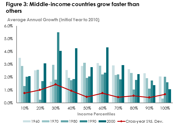
Source: Penn World Table
So, given that these boundaries are arbitrary, what should we do?
1. Accept that income cutoffs divide a world which doesn’t want dividing, and act accordingly. We should be thinking about gentle graduations from IDA or GAVI or any of the other income-determined aid programs. At the other end we should think about gentle enrollment matriculation into common but differentiated responsibilities including action to limit greenhouse gas emissions and the expectation to provide ODA.
2. Try to design groupings fit for purpose. For example, if we want to divide the world into countries that are ODA eligible and those that aren’t, why not take some definition of what we most want ODA to do. As I’ve suggested previously, take Martin Ravallion’s work on which countries could plausibly end $1.25 poverty without outside assistance and declare that the cutoff (around $2,300 Atlas GNI). Or, as it might be, all countries that would need external finance to meet a post-2015 agenda of zero $1.25 poverty, child mortality below 3 percent, and universal access to clean water. If you think aid only works in countries with a CPIA above 3, use that as an additional cutoff. If you think aid only works if you give more than $10 per capita and you only have $10 billion to give, use a calculation that takes that into account.
So, come on World Bank and GAVI and MCC and all you other folks who use an arbitrary line drawn in shifting sands to make aid allocation decisions — you in particular need to try for a better approach.
Topics
DISCLAIMER & PERMISSIONS
CGD's publications reflect the views of the authors, drawing on prior research and experience in their areas of expertise. CGD is a nonpartisan, independent organization and does not take institutional positions. You may use and disseminate CGD's publications under these conditions.