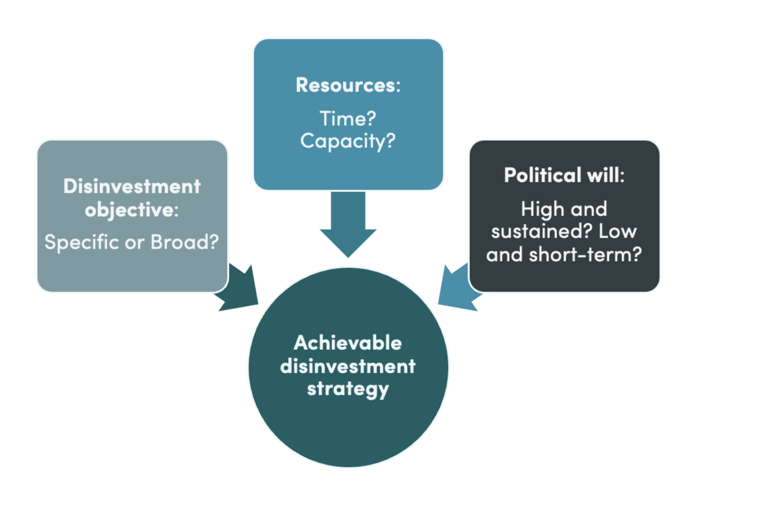

Child vaccination is one of the most powerful and cost-effective tools to save lives. But just how good is the data that we’re using to track progress on this life-saving intervention? In this piece, we examine trends in the quality of government-produced vaccination data. Our main message is that rather than obvious improvement, trends are decidedly mixed: the likelihood that WHO and UNICEF find fault with a country’s vaccination estimates has been pretty flat over time (see figure 1) and so has the size of the discrepancies between government figures and WHO/UNICEF estimates, in absolute terms (see figure 2).
But in the past, over- and under-estimates tended to cancel out on average. That’s no longer true. In the past few decades, countries have become more and more over-optimistic about their vaccination rates. That’s especially true in the poorest countries and is not rooted in issues with measuring newly introduced vaccines.
Where does vaccination data come from?
With some $4 billion spent on inoculating children annually, tracking progress on vaccination rates is a key focus of global health initiatives such as Gavi and UNICEF, not to mention a Sustainable Development Goal. A 2014 CGD working group highlighted how efforts by African governments to track vaccination rates are plagued by low state capacity and bad incentives. Despite such evidence, building better national health data systems has not been a priority of the international community and there is little evidence of overall improvement in data quality in recent years.
The numbers we’re concerned with here are governments’ own estimates of vaccination coverage. Those estimates are reported to the WHO and UNICEF, who publish national and global trends. But the WHO-UNICEF team, known as WUENIC, don’t take country numbers at face value. They compare reported vaccination coverage rates to other existing information and adjust for discrepancies.
Luckily for us, WHO and UNICEF have not only collected national vaccination rate data going back to the mid-1990s, but they have also published some details on when and why they have accepted nationally submitted estimates, or have made adjustments. We used this data to examine the frequency, size, and direction of WHO adjustments relative to nationally submitted estimates.
Figure 1. The probability of a discrepancy hasn’t changed much on average
Percentage of National Estimates Adjusted by WHO/UNICEF, 1999–2017

Source: Compiled by authors using WHO/UNICEF WUENIC data. Countries were classified by low-income, lower-middle income, upper-middle income, and high-income country status as defined by the World Bank in 2022–23. Data were downloaded on 9/26/2023. Countries submit national vaccination rates to the WHO/UNICEF, based on administrative and/or survey data, which in turn are examined and either accepted or adjusted by WHO/UNICEF (see here for explanation). Analysis is limited to country-vaccine data in which there are at least two prior years of government produced vaccination rate estimates.
The probability of a discrepancy in vaccination data is falling in the poorest countries, but not in lower-middle income countries
There are some partial, positive signs on data quality for the poorest countries. On average, the probability that the WHO and UNICEF adjust a low-income country’s vaccination data has fallen over time. While the absolute number of self-reported estimates adjusted by the WHO each year has grown as vaccines have been newly introduced, the chance of an adjustment has fallen off the last two decades to just over 50 percent. The majority of estimates from low-income countries are altered, but these adjustments are becoming less frequent.
However, over the same period the opposite trend is observed from lower-middle income countries. Their estimates have become increasingly likely to be adjusted by WHO, with the share of altered estimates rising from 35 percent in 2004 to 49 percent in 2017. While estimates from lower-middle income countries are revised less frequently than those from the poorest countries, over time the chance of an adjustment has grown.
We note that some of the countries classified today as lower-middle income were designated as low-income in the late 1990s, but have since transitioned. In other words, some countries are “graduating” to a higher-income bracket and becoming more prosperous, but at the same time, the club they have joined has produced worsening quality vaccination data.
On average, discrepancies aren’t getting any bigger, but they are more one-sided
Across all developing countries, the magnitude of the adjustments that the WHO and UNICEF feel compelled to make hasn’t changed much either. On average, in absolute value terms, vaccine estimates during the examined period from a low or lower-income country were adjusted by roughly six percentage points. That includes all the zeroes when no adjustment is made.
When considering the direction of the adjustment though, the picture is more concerning. Countries have generally become more and more over-optimistic in their vaccination coverage rates reported over the past few decades, particularly low- and lower-middle income countries. In 1999, the average adjustment by WHO for both low and lower-middle income countries was less than a percentage point. But by 2017, WHO was trimming lower-middle income estimates by three percentage points on average and low-income countries’ estimates by six percentage points (see Figure 2). By the end of the period more than a quarter of low-income country estimates were getting revised downward by double-digit percentage points; equivalent adjustments upward happen in only one percent of cases. In short, country vaccination data are increasingly overestimated.
Furthermore, these trends do not appear, at first glance, to be driven by issues that occur when vaccines are newly introduced into a country. All of the low- and lower-middle income country tendencies described above hold when limited to vaccines that are present in countries when they first appear in the data (almost always 1997).
Figure 2. Government vaccination estimates are erring more toward optimism over time
Average percentage point gap in vaccine coverage: government estimate minus WHO/UNICEF estimate

Source: Authors estimates based on WHO/UNICEF data. Analysis is limited to country-vaccine data in which there are at least two prior years of government produced vaccination rate estimates.
Why are vaccination estimates getting more biased?
We don’t really know.
A benign explanation is that the national data didn’t deteriorate, but that the WHO and UNICEF changed their standards. Another, more worrying possibility is that quality erodes as countries graduate from foreign aid. This would be consistent with the increase in the frequency of data problems in lower-middle income countries, many of which recently passed the income thresholds for certain types of aid.
But the big increase in bias in national vaccination estimates we document here is in low-income countries. These countries’ health data systems remain heavily aid dependent, and they’re getting worse, not better.
Major global health funders need to pay more attention to why routine data systems for immunization coverage aren’t improving, and in particular how global health initiatives may or may not influence the quality of that data.
We would like to thank the Immunization Analysis and Insights team at the WHO for their help in understanding their data set and methodologies.
Disclaimer
CGD blog posts reflect the views of the authors, drawing on prior research and experience in their areas of expertise. CGD is a nonpartisan, independent organization and does not take institutional positions.
Image credit for social media/web: Riccardo Niels Mayer / Adobe Stock