Recommended

WORKING PAPERS
How much do educational outcomes around the world depend on where you were born? How about your place in the local or global income distribution? Your gender? Or whether you attend a public or private school?
To preview our answers:
The country you live in, more than your income per se, strongly predicts your children’s test scores. Richer countries produce higher scores, even controlling for household earnings.
Poor countries lag further behind than previous studies have found.
Inequality perpetuates itself through education: highly unequal countries have a significantly tighter relationship between parental wealth and children’s test scores.
Private schools may explain some of this pattern. In unequal countries, the affluent are more likely to send their kids to private schools, creating a bigger gap in performance between private and public schools.
Across the global income distribution, girls (who are enrolled in school) outperform boys on reading tests, but this advantage disappears in mathematics except among the world’s poorest.
For as much time as economists spend worrying about these causes and consequences of international differences in human capital, data to make such international comparisons is surprisingly scarce. While statistics on school enrollment are easy to come by, globally comparable measures of learning outcomes don’t really exist.
The basic impediment to comparing learning levels around the world is that students in, say, Peru, Niger, and Italy never take the same test. Richer countries often participate in “international” learning assessments, like PIRLS (for reading) or TIMSS (for science and math). But poorer countries usually don’t. At best, they take regional tests that aren’t comparable across regions or to the international scales.
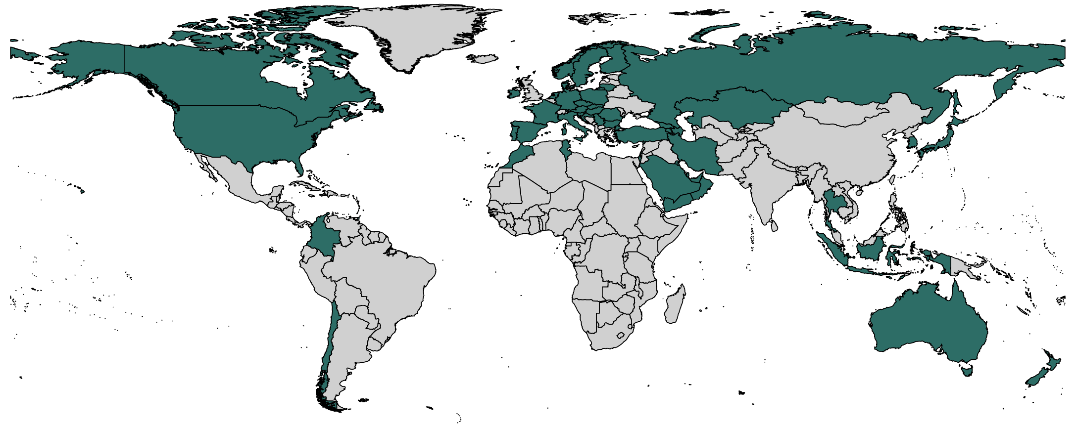
Figure 1. Rich countries take international assessments, poorer countries don’t
(a) TIMSS or PIRLS
(b) Regional Assessments: PASEC, LLECE, and SACMEQ
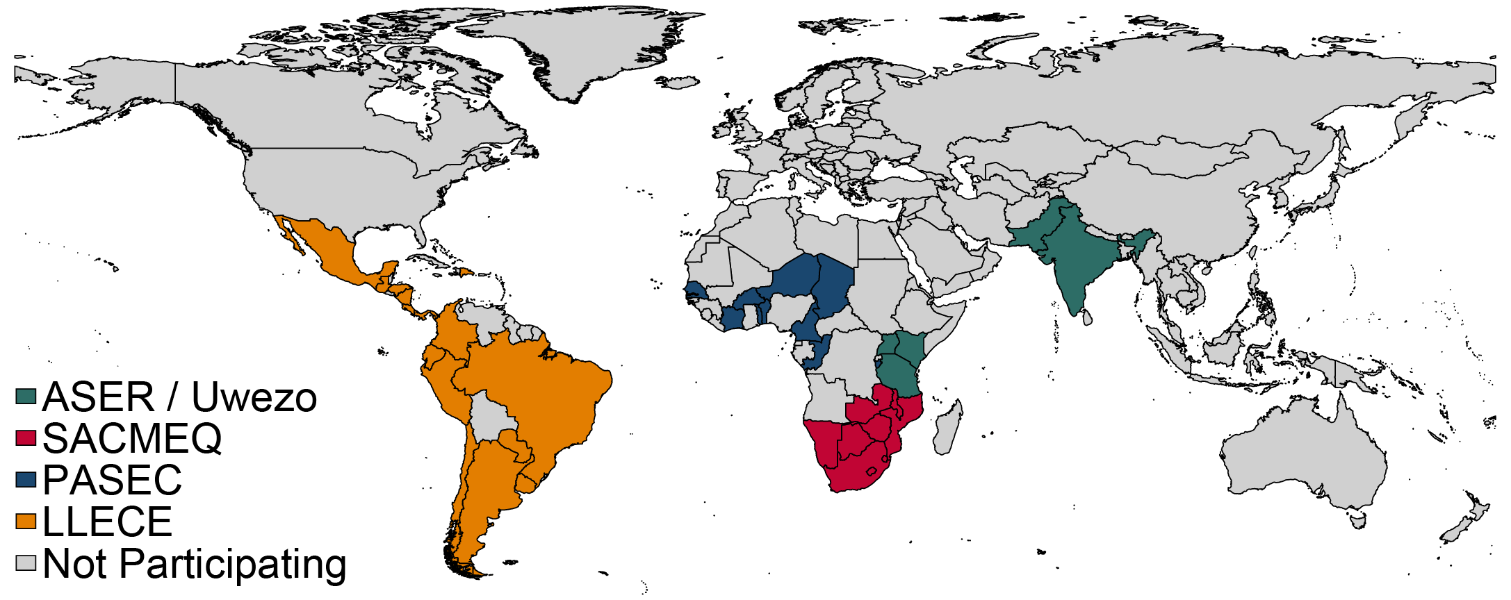
Note: Figure 1 maps the coverage of some of the world's largest standardized tests. Panel 1a shows countries which participated in the fourth-grade Trends in International Mathematics and Science (TIMSS) and Progress in International Reading Literacy Study (PIRLS) in 2011, and panel 1b shows countries which participated in Analysis Program of the CONFEMEN Education Systems (PASEC) in 2014, Latin American Laboratory for Assessment of the Quality of Education (LLECE) in 2013, and the Southern and Eastern Africa Consortium for Monitoring Educational Quality (SACMEQ) in 2007. Data from the World Bank's Education Statistics.
In a new CGD working paper, we propose a very simple strategy to overcome this problem, and to build a “Rosetta Stone” for test scores. We take a single sample of students and give them questions from each major exam around the world. By grading each child’s responses on the original test scales, we calculate scores on different exams for the same child on the same day.
We fielded this hybrid test to a sample of 2,314 fourth- through eighth-grade students in Bihar, India in 2016. This fall, we’ll start replicating those findings with a sample of students in the United States. Building on our initial results, the UNESCO institute for Statistics has launched a program that extends this methodology to build learning metrics of the UN’s Sustainable Development Goals (SDGs). Working with the International Association for the Evaluation of Educational Achievement (IEA), UNESCO will go one step further—administering the full TIMSS and PIRLS tests to the same sample of students who sit regional tests from Latin America and West Africa.
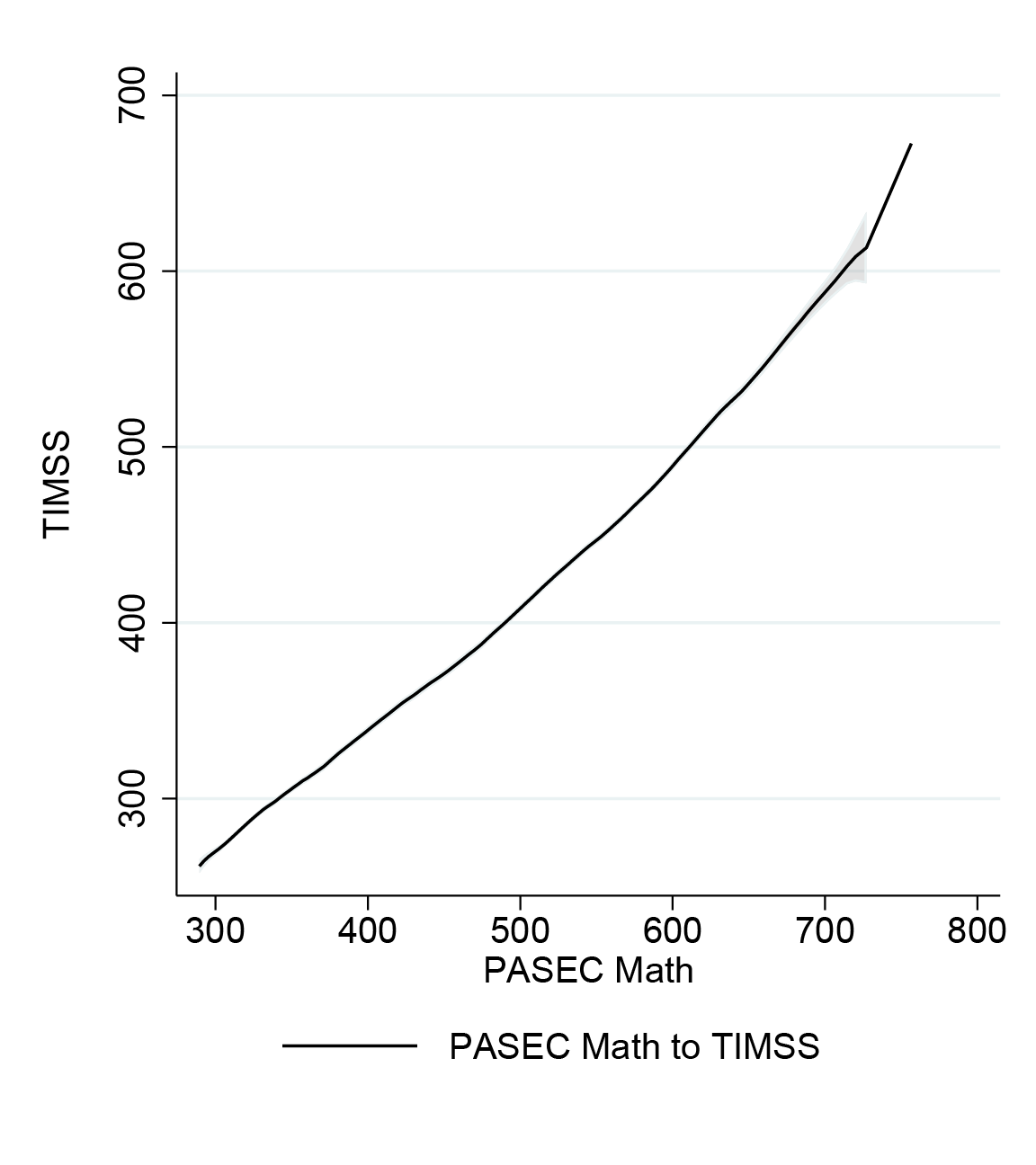
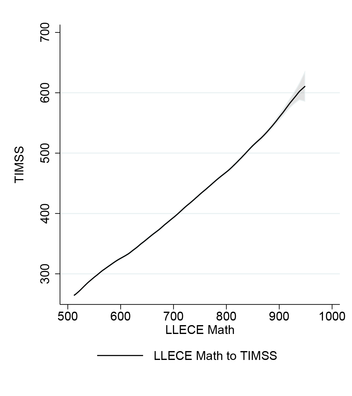
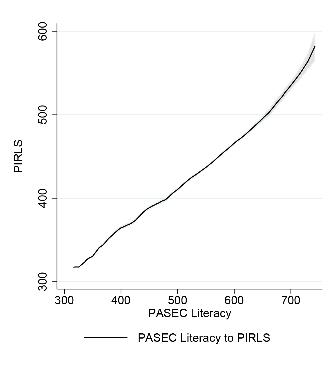
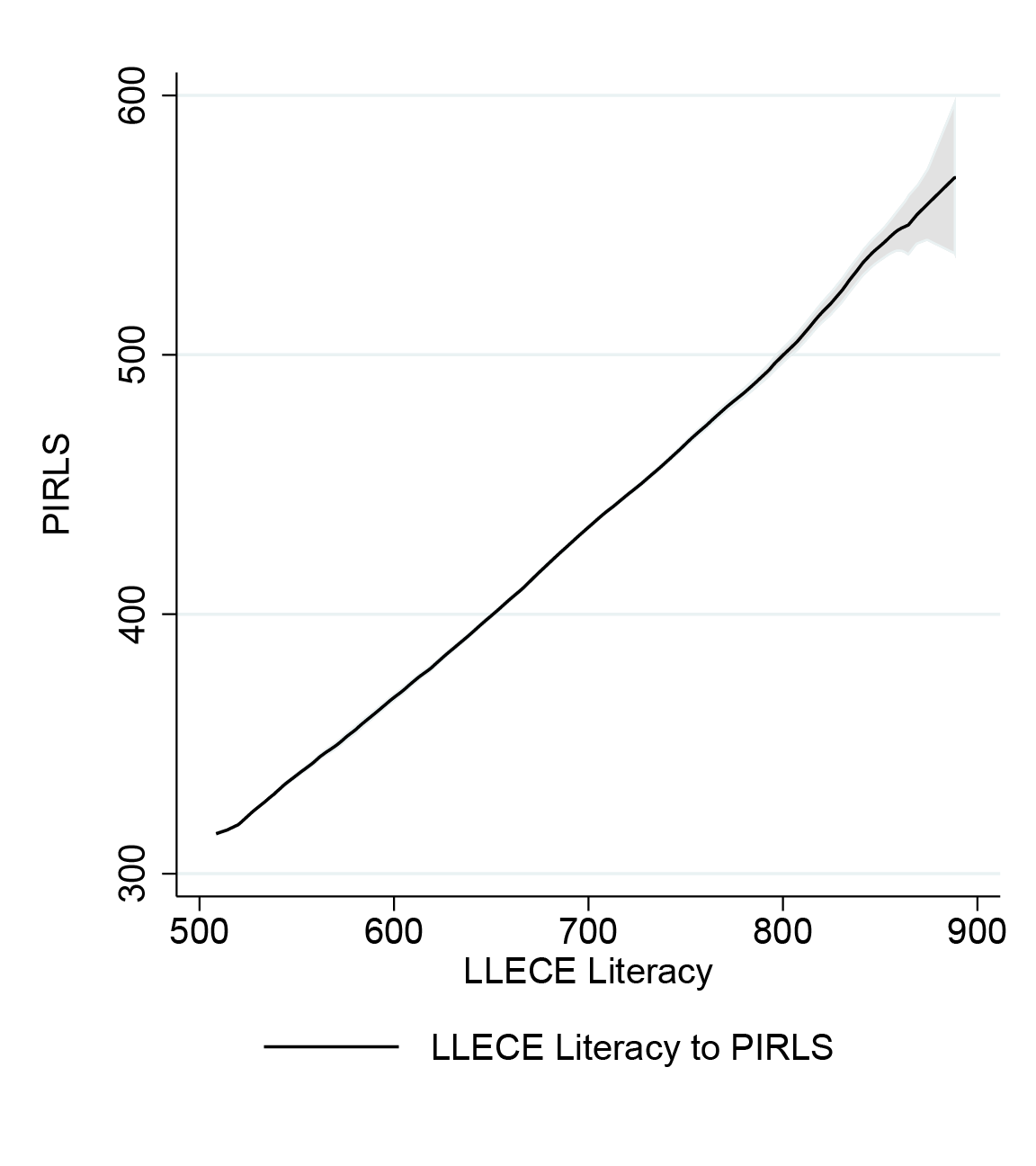
Figure 2. The Rosetta Stone: Translating scores between tests
(a) PASEC to TIMSS
(b) LLECE to TIMSS
(c) PASEC to PIRLS
(d) LLECE to PIRLS
You can download the full set of conversions here.
To get an intuitive sense of how these tests compare, note that most international and regional assessments are scaled so that a median student scores 500. But those medians differ. Our Rosetta Stone implies that a median math score of 500 in West and Central Africa’s PASEC is equivalent to about 375 on the international TIMSS scale. That implies the median student in, say, Senegal scores at about the 2nd percentile in Germany.
For now, we estimate these “translations” between international test scores based on our hybrid test administered in Bihar. In principle, it doesn’t matter who or where that hybrid test is administered—we just need one group of kids to take (parts of) all the tests—but again, for robustness, we’ll be testing that premise by replicating the results with a sample of middle-school students in the United States. We used techniques from item response theory to grade these tests as if they were the original exams. We’re able to do this because every test we combine (TIMSS, PIRLS, LLECE, and PASEC) uses IRT when they grade each question. By using the same statistical parameters as the original exams, we can estimate scores for each student on the original scales. The hybrid exams and complete replication data and code can be downloaded here.
Figure 3. Country rankings: Combining disparate tests shows how far developing countries lag behind the OECD
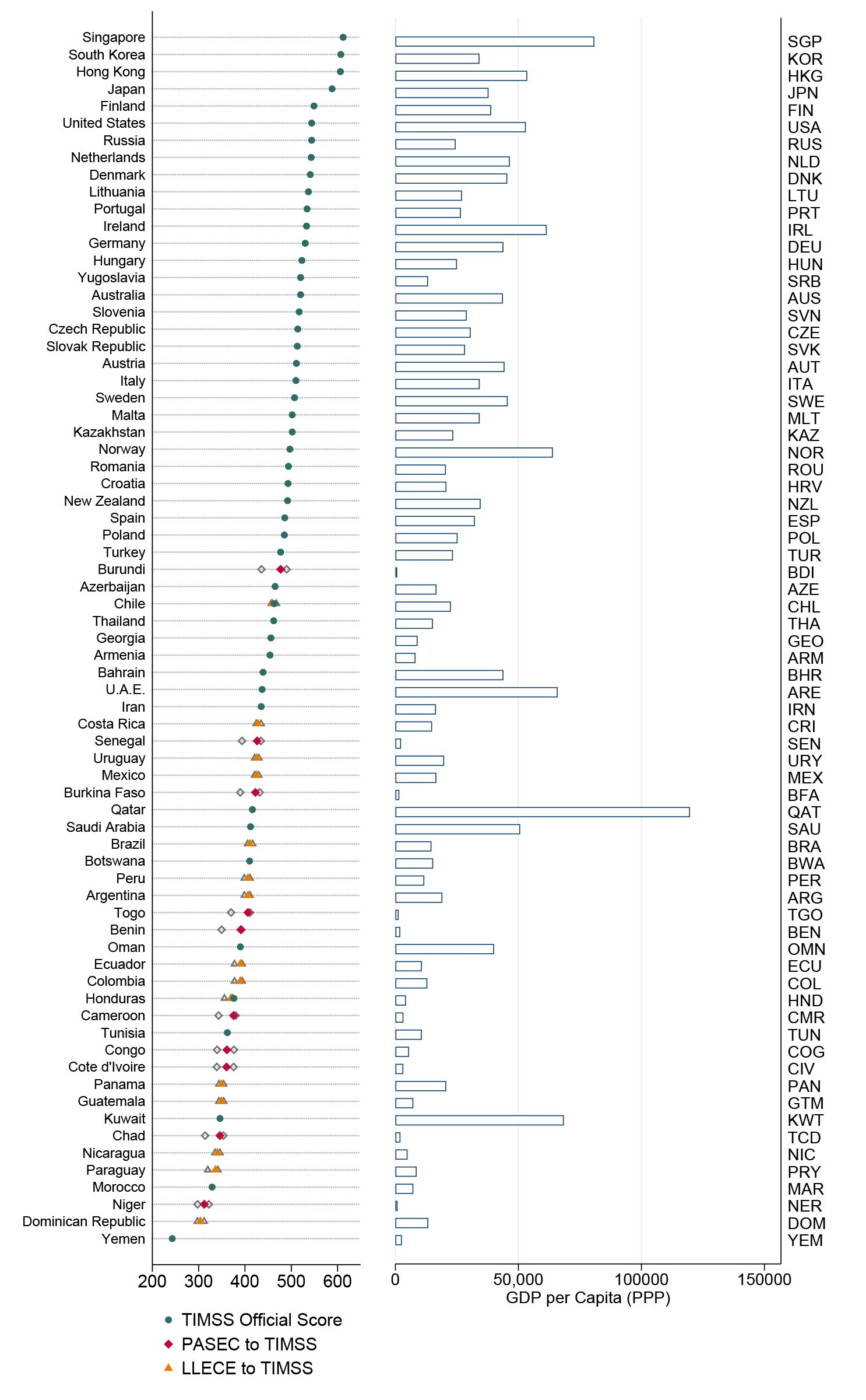
Equipped with our “Rosetta Stone,” we can convert the test scores of more than 600,000 students who only took one of the tests onto a common math and reading scale. We calculate new country scores based on the median performance of fourth-grade students. The full set of country scores can be downloaded here.
It’s worth pausing to ask how much the approach used here—and being taken up by UNESCO for measuring progress on SDG 4, the goal of equitable education for all—actually improves upon earlier efforts to link test scores around the world. One prominent alternative approach, proposed by Nadir Atlinok and Hatidje Murseli and extended in a series of papers by Altinok and coauthors, creates a link between test score scales by exploiting countries, as opposed to students, that took multiple tests. This approach has been adopted recently by the World Bank, as part of its Human Capital Index. One challenge is that while a small number of countries do take multiple tests, they are usually administered in different years, to different cohorts of students, and quite often to different grade levels. As a result, the conversion functions implied by this approach are sensitive to the few countries included which can often contradict each other. Nevertheless, the average results of this “doubloon countries” approach are not wildly different from what we find here with our sample of “doubloon students.” If we limit ourselves to focusing on country averages as shown in Figure 3, the Spearman rank correlation between the two methods is about 0.9. That said, our approaches disagree quite a bit for the poorest countries, especially in West and Central Africa, where our pupil-based linking method finds significantly lower scores. We think UNESCO is justified in holding out for a more rigorous linking method based on the traditional psychometric tools of item response theory.
Figure 4. The quantity and quality of schooling across countries is pretty weakly correlated
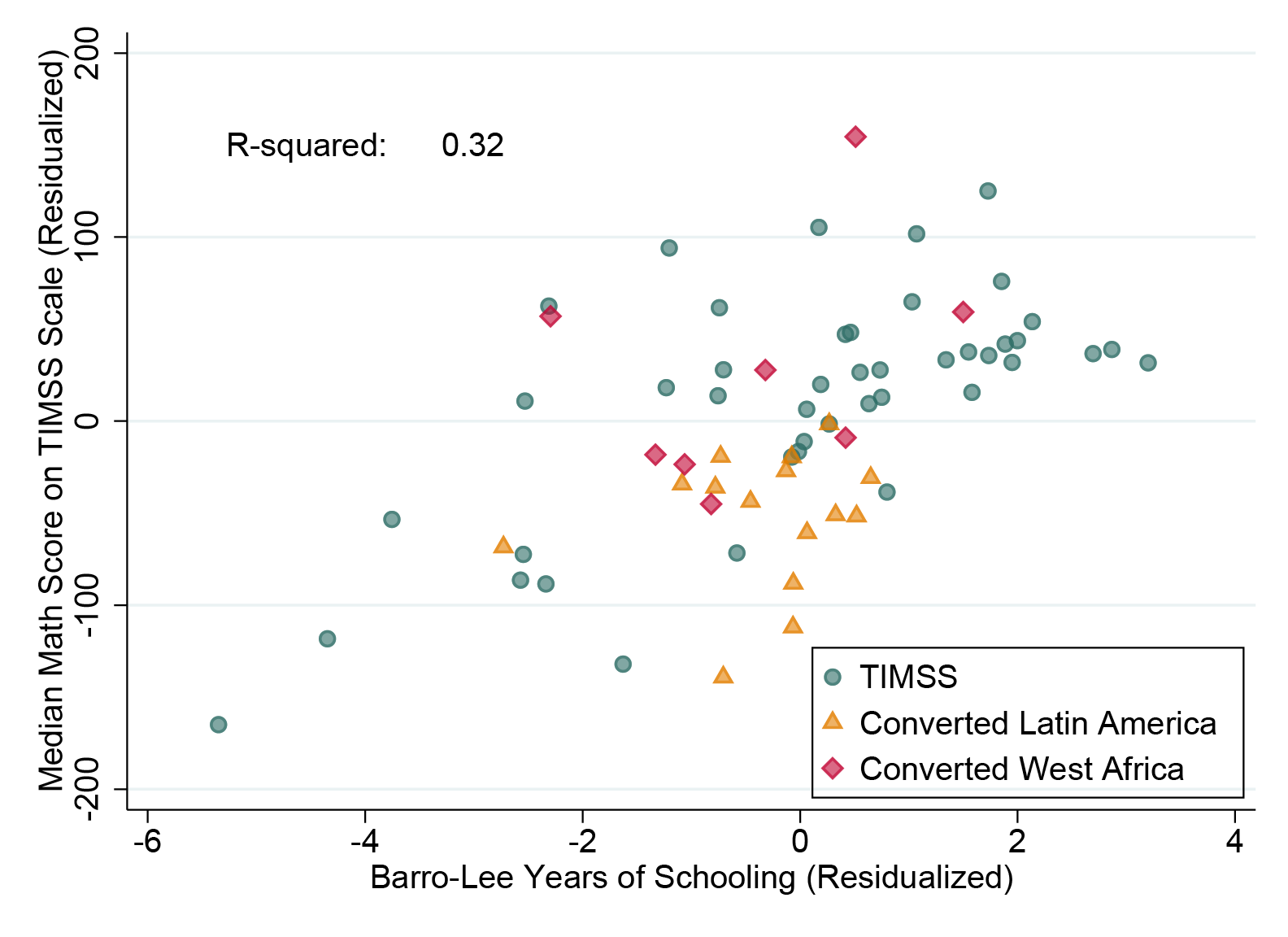
The vast bulk of economics research comparing human capital across countries (and even across individuals) ignores learning outcomes entirely, and relies instead on measures of years of schooling as a proxy for human capital. Robert Barro and Jong-Wha Lee’s global data set enabled a slew of papers in the 1990s and 2000s correlating economic growth with years of schooling, with somewhat inconclusive results.
Optimistically (for researchers, not really for the world), one might hope that differences in average years of schooling across countries are pretty highly correlated with test scores, and so relying on quantity as a proxy for quality isn’t so bad. As it turns out though, the correlation is pretty low: just 0.32 in our sample after conditioning on per capita GDP.
There is a camp of researchers, notably Eric Hanushek at the Hoover Institution, who see test scores rather than years of schooling as a key driver of economic growth. We take no sides in that debate, except to express some pessimism about resolving causal questions in cross-country data. Looking at individual incomes in microdata, years of schooling have quite a bit of explanatory power in the developing world, with a statistically significant but often modest additional role for learning outcomes.
Figure 5. Education spending is more highly correlated with test scores among developing than developed countries
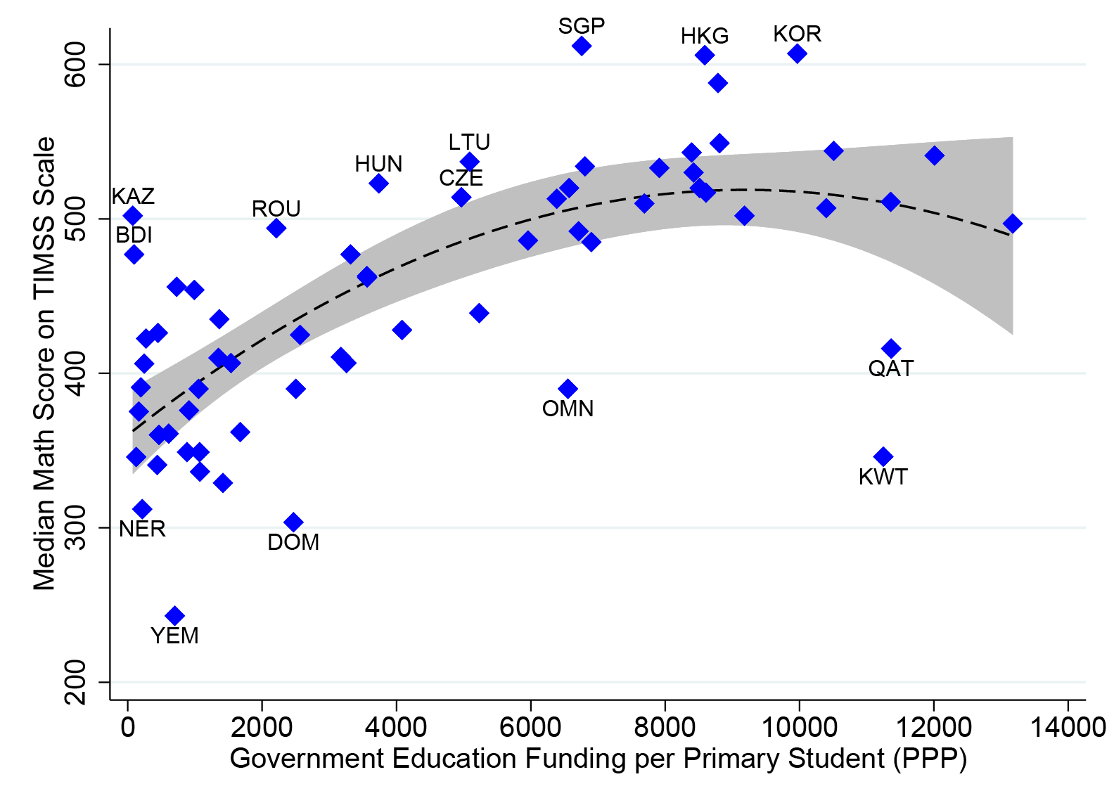
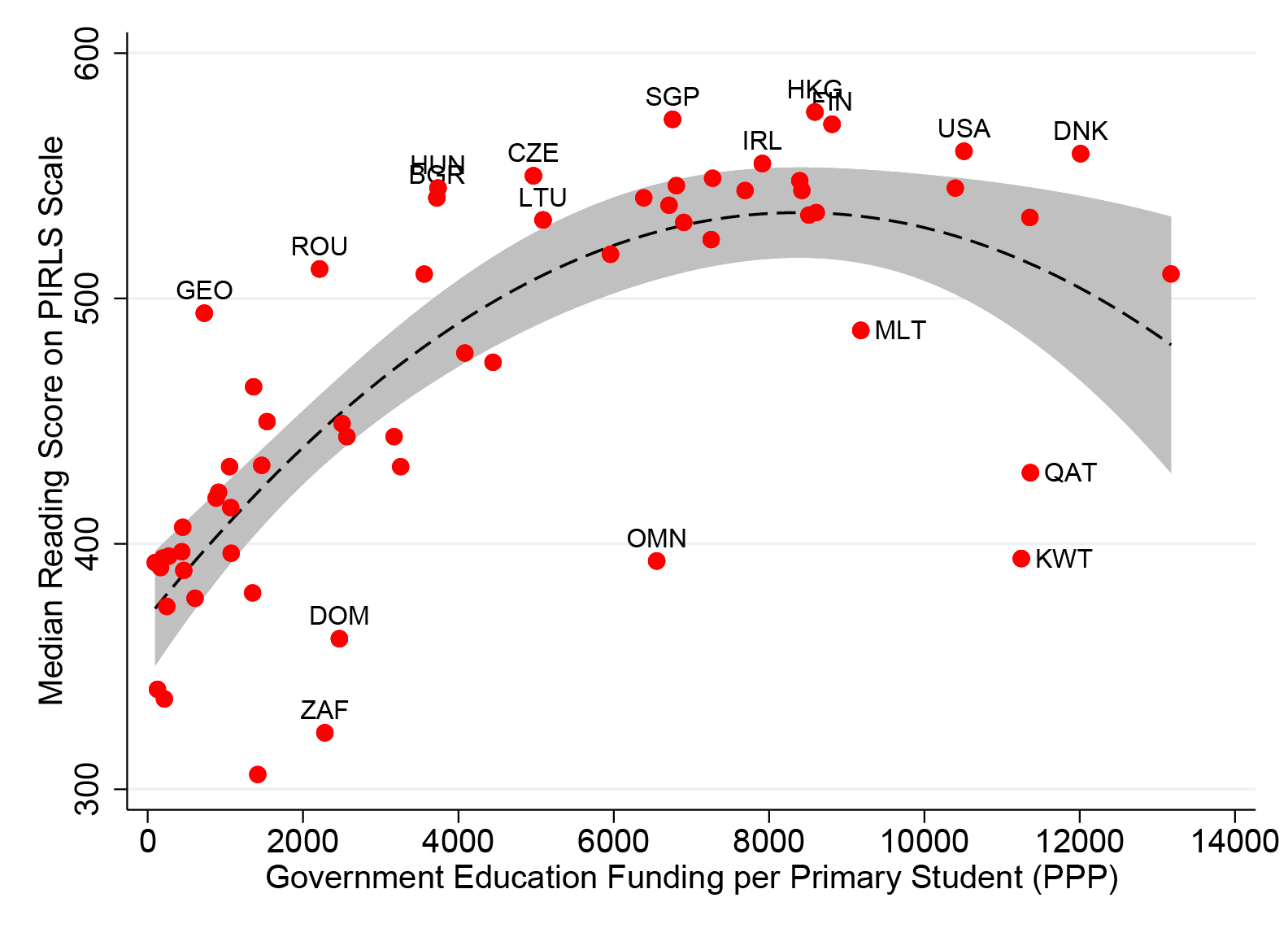
Setting aside the elusive quest for the causes of economic growth, what explains why some countries score so much higher than others on international learning assessments?
The relationship between education spending and test scores has generated its own large and contentious literature, that we make no claim to resolve. But we can extend the sample a bit. While correlation is emphatically not causation—and in this case, the list of omitted confounders is too long to bother mentioning—it is notable that while the association between spending and test-scores is weak across developed countries, it’s considerably steeper at the lower spending levels observed in the developing world. Note that without linking test scores globally, one can’t make this comparison, because the slopes are measured in different units.
Figure 6. Students with the same household income have higher test scores in richer countries
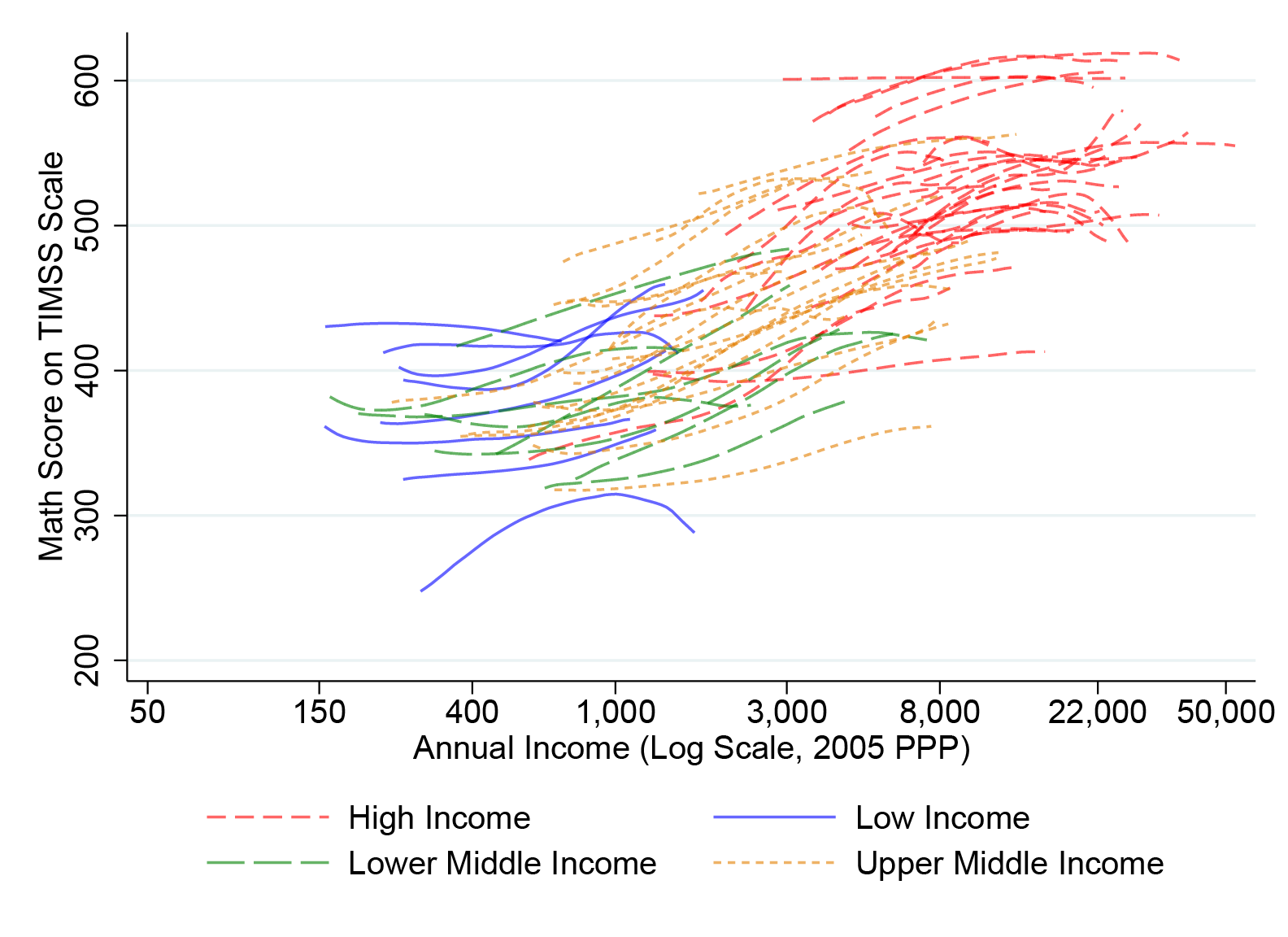
Would you rather be a poor student in a rich country, or a rich student in a poor country? Amartya Sen famously pointed out that life expectancy for Black people in the US is lower than for the (much poorer) population of Kerala, India. Might the same logic hold for learning outcomes?
Having linked test scores across a diverse array of 80 countries, we attempt to place each of the 628,587 students who took all the underlying tests on the global income distribution. Admittedly, it requires one strong assumption.
Each test collects a list of socio-economic indicators on students, which are combined into an overall “wealth” index. Unfortunately these wealth indices aren’t comparable across countries: having parents who own a house, for instance, or completed secondary education, means very different things in purchasing-power parity (PPP) terms if you’re in France versus Côte d’Ivoire. To overcome this problem, we map students’ domestic percentile on the wealth index to the same percentile in the distribution of income or consumption. The core assumption required here is that your rank in the wealth distribution is a good guide to your rank in the income distribution. Assuming this holds, we can draw on Christoph Lakner and Branko Milanovic’s compilation of global income distribution data, and place students from around the world on a comparable, global, socio-economic scale in PPP dollars.
Each line in Figure 6 shows the relationship between household income (per capita, in PPP dollars) and math scores for a different country.
A striking pattern emerges. Unsurprisingly, in almost every country, richer kids post higher test scores (more on that below). But what is less obvious is that at a given level of household per capita income in PPP dollars, kids from wealthier countries score much better than kids in poor countries. It’s not just your own socio-economic status that matters, but the wealth of the country you live in that determines your educational outcomes. In terms of test scores, it’s better to be (relatively) poor in America than (relatively) rich in Honduras.
The strength of those country effects is huge. Controlling for a household income as flexibly as possible, we still find that country fixed effects explain over half of the pupil-level variation in reading scores, and about two-thirds of the variation in math scores.
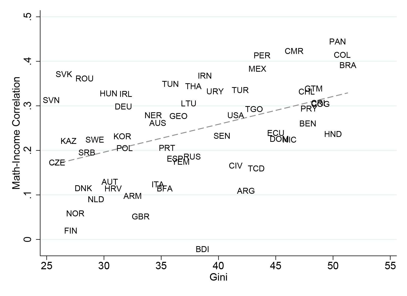
Sen showed that survival—as objective and universal a welfare metric as one could imagine—depends on your relative position in society. We don’t quite find that same pattern in education. Being poor in a rich country seems to produce higher test scores than having the same income in a country where that leaves you relatively better off. But as we show in Figure 7, that’s not to say inequality doesn’t matter; on the contrary.
Figure 7. The Great Gatsby curve: Test scores are more correlated with parental income in countries with greater income inequality
(a) Math
(b) Reading
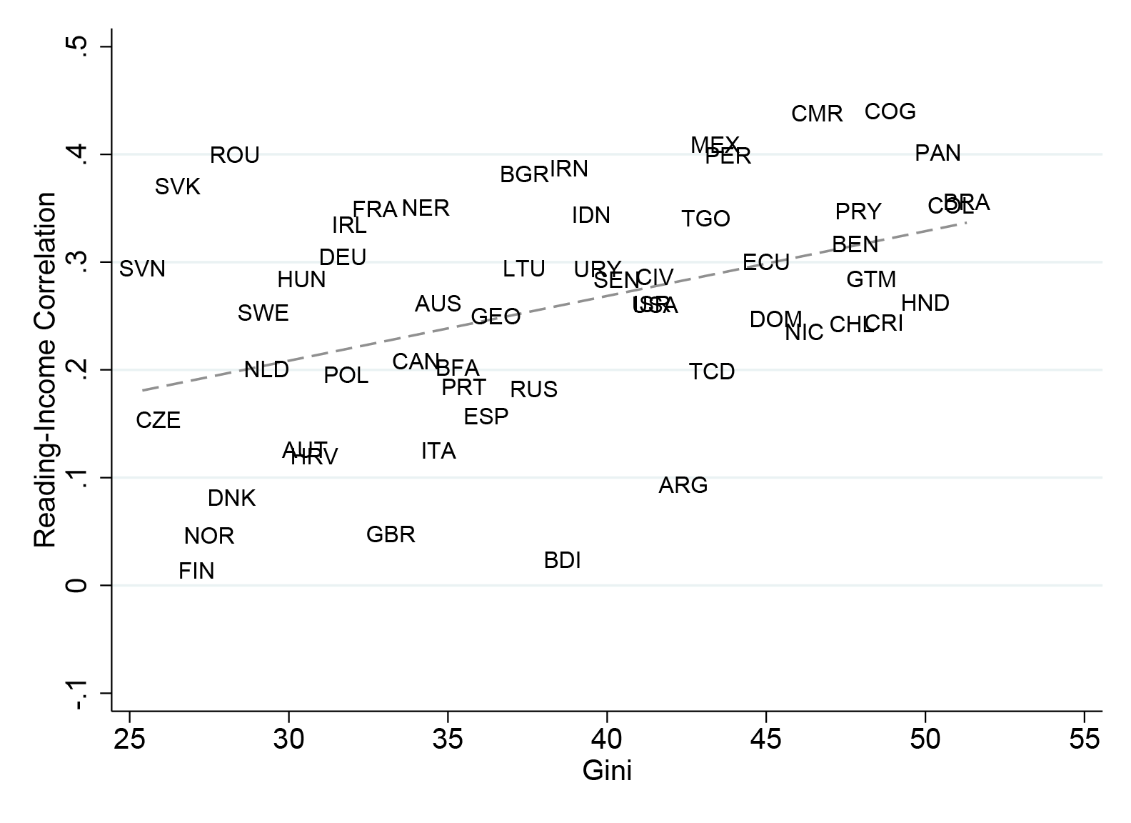
Education is supposed to be a great equalizer. But that’s often not true. To see how this plays out in Figure 7, note that the relationship between kids’ test scores and their parent’s income or wealth provides a crude by readily available measure of intergenerational mobility across a wide range of countries.
We’ve written before on this blog about the “Great Gatsby Curve,” and its analog in test score data. In short, earlier work by Miles Corak, and popularized by the late Alan Krueger while working in the Obama administration, showed that across multiple OECD countries high income inequality was associated with less economic mobility. As Corak put it:
“Is inequality a good thing, reflecting the fruits of skill and ambition and offering a promise of possibility for the next generation? Or does it skew opportunity, crudely mirroring the power of privilege and place and reflecting unfair barriers to success regardless of talent?”
The Gatsby curve hints at the latter, uglier hypothesis.
Where inequality is higher, the opportunity for poor kids to get ahead through schooling is diminished. If your household is one standard deviation richer than your neighbors in Brazil (with a Gini over 50), you can expect to score about 34 points (.3 standard deviations on the original scale) higher on the TIMSS. If you have the same wealth gap in Norway (with a Gini well below 30), you get basically no advantage in test scores. So inequality not only puts poor students further behind their peers on standardized tests, it also makes it harder for them to overcome a given income gap.
Our next finding suggests one possible reason for that.
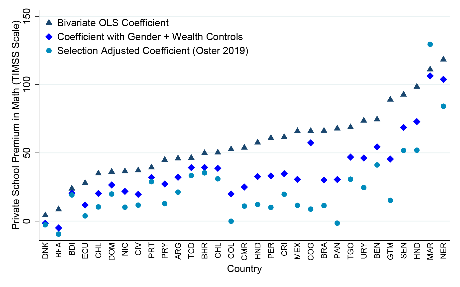
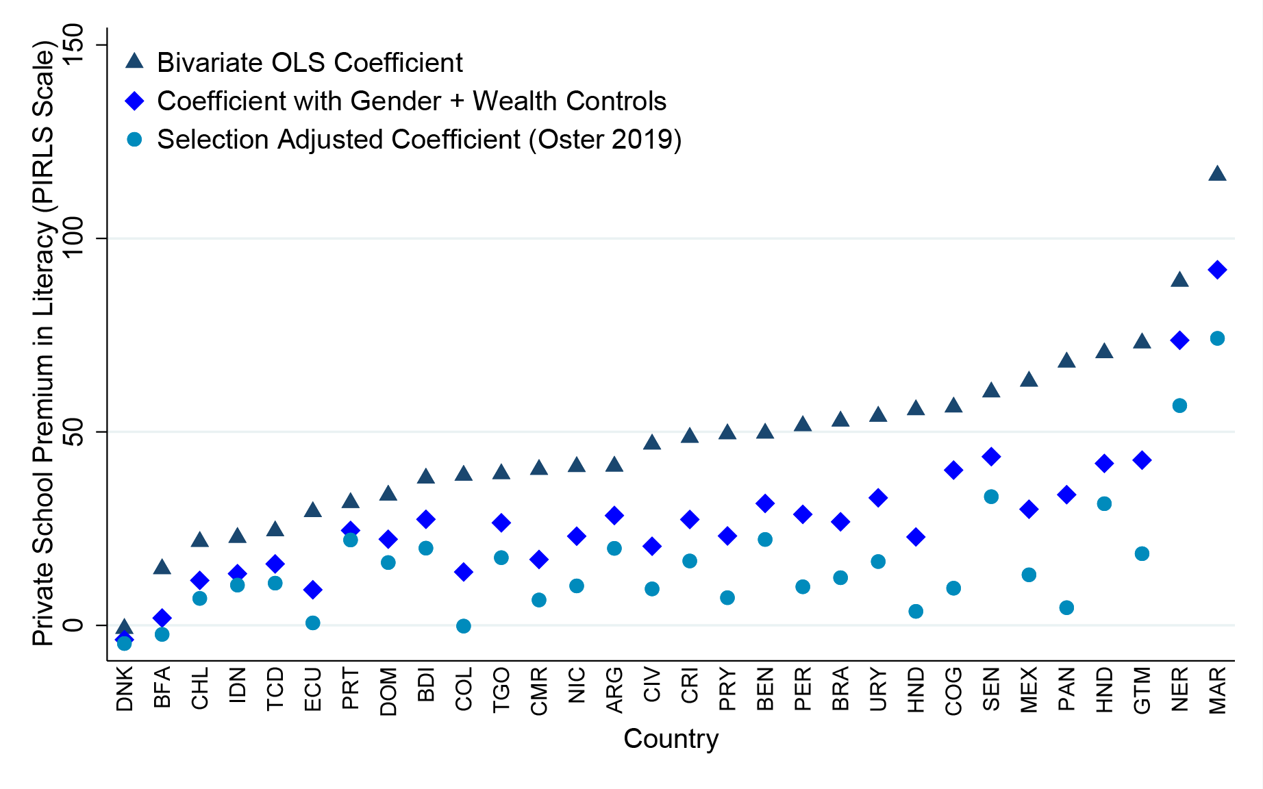
Figure 8. Where income inequality is high, private schools attract more rich kids and outperform public schools.
Panel A: Private-public school gap in math scores
Panel B: Private-public school gap in reading scores
Panel C: Private-public school test-score gaps (betas) and income inequality
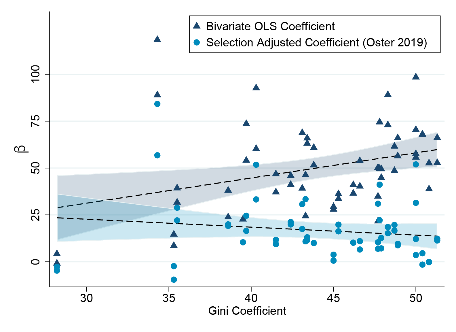
Private schools post higher test scores than public schools in almost every country of the world for which we have data. Linked global test scores allow us to put this phenomenon in comparative perspective: it turns out the magnitude of the private-public gap varies enormously, from roughly 100 points (a full standard deviation) on the TIMSS scale in parts of Niger and Honduras, to roughly zero in Denmark.
But higher raw test scores don’t imply better education. Private schools attract richer students, who are more prepared and have a host of other academic advantages. Simple adjustments for students’ socio-economic background dramatically narrow the private-public test-score gap in most countries.
The sorting of richer students into private schools appears to go hand in hand with higher income inequality—which may help explain the link between income inequality and reduced intergenerational mobility in the “Great Gatsby curve.” As income inequality rises, the raw test score gap between private and public schools rises too. But that appears to be entirely due to increased socio-economic segregation. Controlling for student wealth, the relationship between inequality and private-school advantage disappears.
Figure 9. Girls read better than boys at all incomes, but only outperform them in mathematics at the lowest deciles of the global income distribution
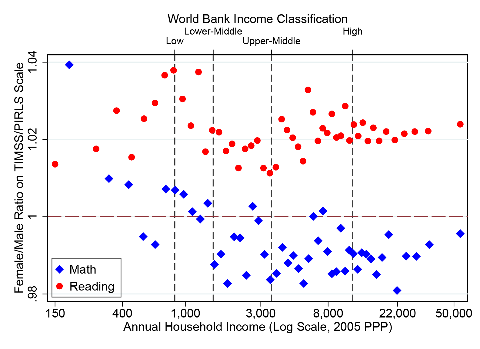
If your image of gender inequality in education globally is of girls in poor countries getting left behind, you’re not totally wrong—primary school enrollment rates for girls remain behind those of boys in low-income countries.
But conditional on going to school, the opposite pattern holds. Girls outperform boys on reading tests across the global income distribution. And girls also show a test-score advantage in math at the bottom of the income distribution, below incomes of roughly $2,000 a year in PPP terms. It’s actually at higher incomes where girls fall slightly behind in math.
As a caveat, note that these two phenomena may interact. Differential enrollment between girls and boys in developing countries means that sample selection may explain some of girls’ math advantage. To account for this, where boys enrollment is higher than girls by, say, X percent, we “trim” the distribution by dropping the lowest performing X percent of boys—thus our findings on girls’ relative advantage are quite conservative.
In sum, linking standardized tests from around the world shows how global inequality explains education outcomes—within and between countries. Future work will be important to improve the robustness of these results—stay tuned for our replication in the US, and UNESCO and IEA’s results sometime next year. But we hope we’ve illustrated that by combining tests from multiple regions onto a single scale, we can learn quite a bit about the enormous differences in educational opportunity between rich and poor countries, and also how high levels of inequality within countries may contribute to increased socio-economic segregation, rich flight to private schools, and reduced intergenerational mobility.
Downloads:
Disclaimer
CGD blog posts reflect the views of the authors, drawing on prior research and experience in their areas of expertise. CGD is a nonpartisan, independent organization and does not take institutional positions.