This is a joint post with Sarah Dykstra.
Nicola Gennaioli, Rafael La Porta, Florencio Lopez-de-Silanes and Andrei Shleifer have just published a fascinating paper in the QJE: “Human Capital and Regional Development”. They constructed a database of 1,569 subnational regions across 110 countries covering GDP, population, education levels, geographic and institutional factors, and looked at correlates with higher per capita income. They suggest that geography and education are significant correlates of regional GDP, while their measures of institutions and culture are less well correlated. They have followed up with a working paper using an expanded dataset, “Growth in Regions” that reports regional convergence of 2.5% a year and note that a rate so slow suggests “significant barriers to factor mobility within countries.”
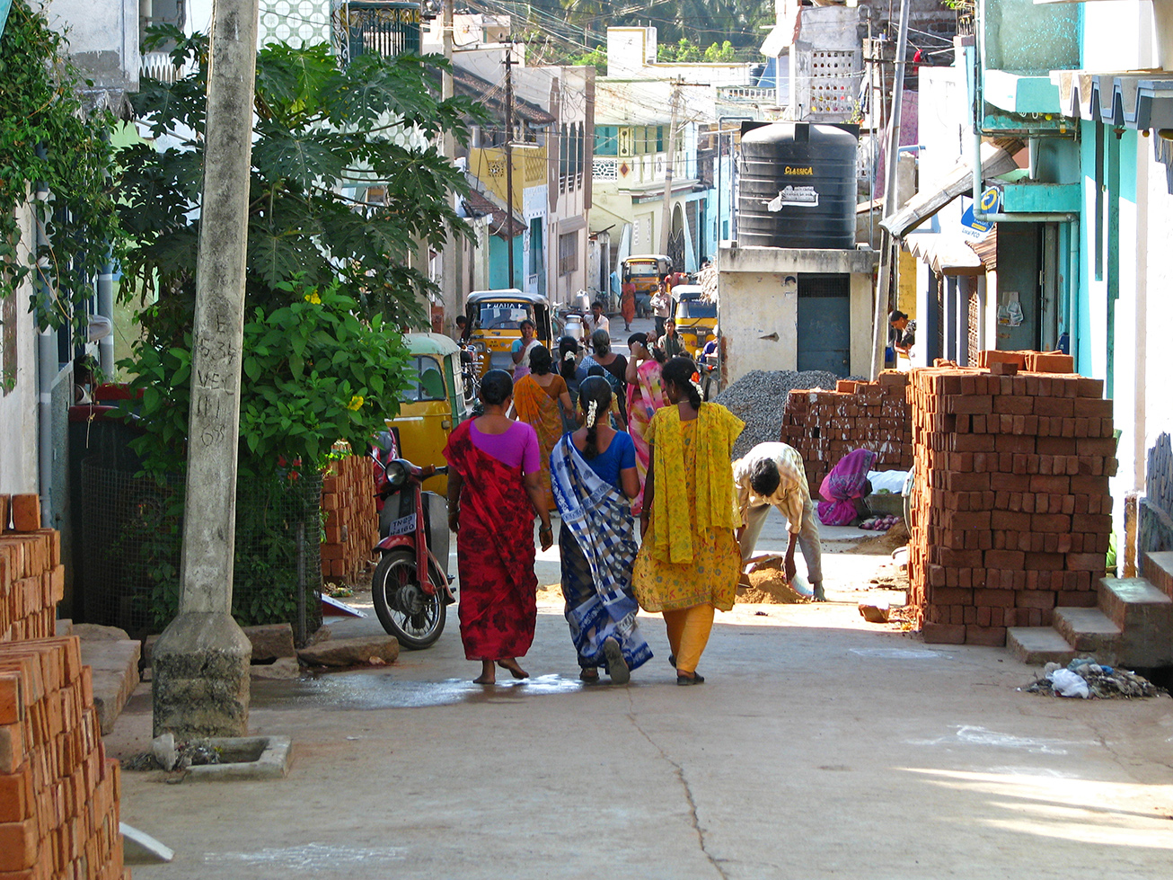
Convergence has been slow enough within countries that very significant subnational income variation remains–for example, the richest Mexican state (Campeche) is 16.4 times richer than the poorest state (Chiapas). That suggests looking at national-level average GDP per capita misses a big part of the picture when thinking about relative income around the world.
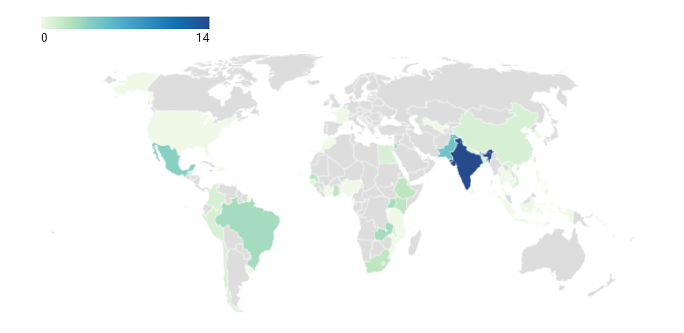
La Porta and the team were kind enough to share not only their data but also an ESRI shapefile which allowed us to create a world map of regional GDP per capita, below. The map is in ten shades from red to blue with each shade representing a decile of regional GDP levels (so the poorest 149 regions are in bright red, with an income of below $2,000, the next 149 poorest are between $2,000 and $3,500 –and so on up to the richest states on an income over $33,900). We’ve also made a country-level map using data from the World Development Indicators and the same income categorizations below that.
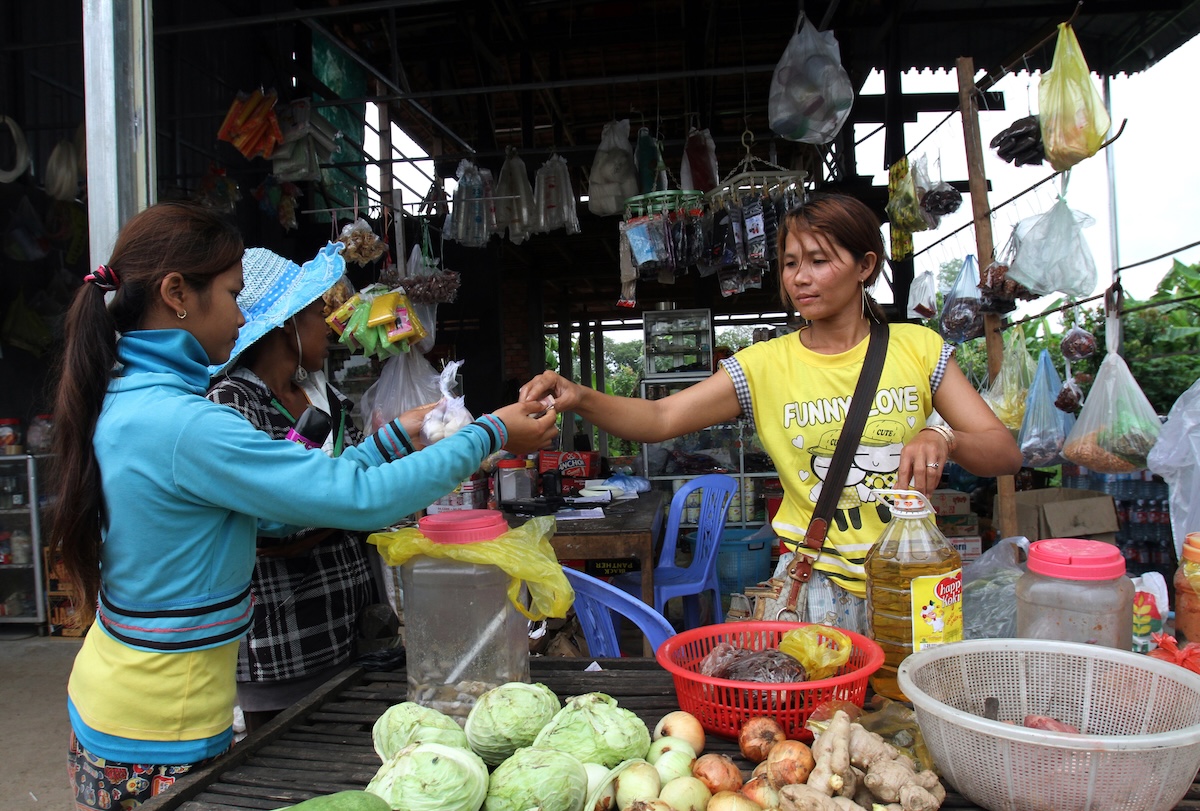
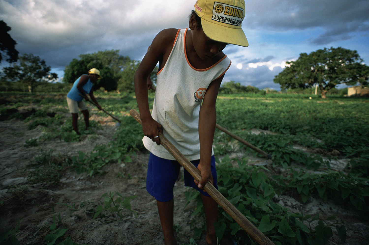
Looking across the planet it is interesting to see pockets of poverty in Asia, Latin America and even Eastern Europe. Similarly, there are pockets of OECD-level wealth across those same regions. Looking within countries, Russia and Mexico go through much of the spectrum. All of this suggests there’s certainly a lot more to the (income) development story than national history and institutions.
A warning on data. Gennaioli et. al.’s regional GDP numbers come from a diverse range of sources including Human Development Reports and government agencies. They’re adjusted so that, when population weighted, they equal the (Purchasing Power Parity) GDP reported at the country level in the World Development Indicators. GDP numbers in much of the developing world are not very reliable.
And the process of developing PPPs to compare across countries is hardly simple and straightforward (not to mention they vary within countries). Caveat spectator.
(Click on maps below to view higher-resolution versions)
Source: regional data and GIS map from Nicola Gennaioli, Rafael La Porta, Florencio Lopez-de-Silanes and Andrei Shleifer “Human Capital and Regional Development” QJE 128,1. National data from World Development Indicators. We used the latest available data for each region. Regions without GDP data between 2000-2010 were not included. Our .do file is here. Full-resolution subnational map here.