Recommended


I'm not a huge fan of arbitrary lines through country income levels to create income thresholds. That is because there is no obvious clustering of countries within the global (country-level) income distribution, and moving from one income status to another does not correlate with trend breaks or end points in anything else we care about. But arbitrary income lines do matter. Not least, based in considerable part on arbitrary-line-drawing, countries are divided into Global North /developed /industrialized /rich and Global South /developing /industrializing /poor. But also (and related), they help determine who gets low interest loans from the World Bank, aid eligibility, debt relief, and climate assistance. So, making these lines better might be a second-best strategy to help improve a range of global development outcomes. And embracing wealth and poverty as relative concepts may be the way to go.
Take the World Bank’s High, Upper and Lower Middle, and Low Income classifications. These were originally set in 1989, based on existing internal World Bank operational cutoffs for lending and procurement practices (who gets cheap loans, who can favor domestic suppliers in procurement). These per capita GNI measures use market-rate dollars (sort of: see here for how to calculate ‘Atlas GNI’), with the 1989 thresholds updated over time using an ‘SDR deflator’ that in turn is (now) based on inflation rates in China, Japan, the United Kingdom, the United States, and the Euro Area.
Surely it needs no further explanation why World Bank internal operational cutoffs as of 1989, based on market exchange rates and updated by an SDR deflator, are the most rational method for choosing country groupings that determine a bunch of global financing decisions and frame discussions on the state of global development. Right?
Because the world is a lot richer than it was three decades ago, low-income countries have dropped from 30 to 13 percent of classified economies between 1989 and 2022, and high income countries have increased from 25 percent to 37 percent between the same years. And in recent work with Zack Gehan, I forecast the likely distribution of the world’s countries by existing income classification in 2050. The proportion of the global population in low-income countries may well drop to zero by 2050, in the worst of circumstances it is likely to be below 7 percent. High income countries’ share of the global population will rise from 16 to between 28 and 43 percent of the World. What was a classification for the very rich in 1989 will likely include countries at about the global average income by 2050.
I’ve suggested reforming the income classification lines before, based on perhaps slightly-less-arbitrary approaches, but here’s a different proposal for the World Bank ,and all who follow in its wake, on the issue of classification: fully embrace purchasing power parity (which better measures actual incomes than market exchange rates do) alongside the relative nature of income comparisons. Use global (population weighted) median country income in purchasing power parity as the anchor, and set income cutoffs relative to that anchor.
The graph below shows the global population distribution by country PPP income per capita, from the poorest, Burundi ($780 per capita) to the richest, Qatar ($88,060). The median line, weighted for country population, is in red: at $12,000 per capita in purchasing power parity. Horizontal lines mark off half of that amount, twice and five times the median. We can call the resulting groups low, middle, high, and super-high. Low and high (including super-high-) income countries are each home to about 20 percent of the world’s population.
Low-income countries have an income per capita of below $6,000 in purchasing power parity. Countries ‘just low income’ by this definition (within $1,000 of the cutoff with middle income status) are Pakistan, Djibouti, Ghana, Angola, and Belize. Middle-income countries have an income per capita between $6,000 and $24,000. Countries ‘just middle income’ are Cabo Verde, Bangladesh, Tuvalu, India, and Samoa. Countries are ‘rich’ if they have an income of $24,000 or more. Economies just below the ‘rich’ threshold (with an income between $22,000 and $24,000) are Nauru, Mauritius, Puerto Rico, and Chile. ‘Just rich’ are Bulgaria, Kazakhstan, St. Kitts and Nevis, and Panama.
And super-rich countries, home to 384 million people, have an income per capita of $60,000 or more. They include Denmark, Hong Kong, the United States, Norway, United Arab Emirates, Brunei Darussalam, Switzerland, Ireland, Macao, Bermuda, Luxembourg, Singapore, and Qatar. If you want a more expansive definition of super-rich, drop the level of four times the median: $48,000. That would include Germany, Austria, Belgium, Australia, the Netherlands, and Denmark (and a total of population of 547 million), though still exclude France, Canada, the UK, and Japan.
Maybe these aren’t the right lines. Another approach would be to set cutoffs based on the country income at a given percentile of the global population. Regardless, even better-designed country income classifications ought not to be the sole basis for making decisions on global financial flows, in part because the right line for one policy intervention will likely be the wrong one for another. But surely it is past time to either abandon using an utterly arbitrary cutoff system for making important decisions or at least reform the cutoffs so that they are slightly less detached from present-day reality.
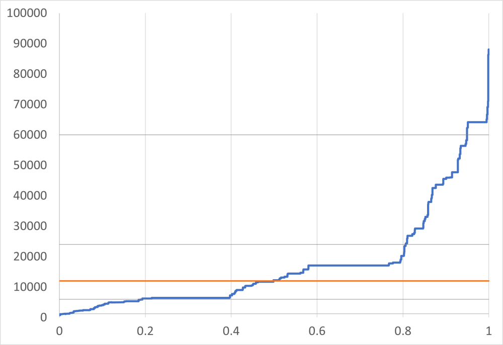
Figure: Global population distributed by country income, median (orange) low, high and super-high cutoffs.
Disclaimer
CGD blog posts reflect the views of the authors, drawing on prior research and experience in their areas of expertise. CGD is a nonpartisan, independent organization and does not take institutional positions.
Image credit for social media/web: Adobe Stock